")
When discussing Pantone colors, they typically refer to the hues designated within the Pantone Matching System (PMS). PMS is a standardized color system widely used in various manufacturing sectors, identifying colors by assigned numbers. In 1963, Pantone developed this inaugural color matching system. As a result of PMS, consistency in colors became achievable.
For example, designers can verify and reproduce their chosen colors accurately through Pantone for printing purposes. So designers and users have the ability to preview how their selected color would appear on various types of paper within the system.
Pantone Matching System includes solid and process colors.
-
Solid colors, or spot colors, provide the most accurate representation of color in graphic arts which applies a single color during printing.
-
Process colors are typically created by mixing varying percentages of four ink colors known as CMYK (cyan, magenta, yellow, and black) and are used when precise color matching isn’t crucial.
What are RGB and CMYK, similar to Pantone?
RGB and CMYK are concepts that are useful to distinguish from Pantone.
")
Made by MiriCanvas
-
RGB: The RGB color model, representing Red, Green, and Blue, is primarily employed in digital displays. Through this model, colors are formed by mixing various intensities of red, green, and blue light to create a diverse range of hues. Nevertheless, RGB is unsuitable for print applications, as printed materials utilize a different method to depict colors. When printing using RGB, colors usually appear darker.
-
CMYK: CMYK represents Cyan, Magenta, Yellow, and Key (Black) and serves as the standard color model in printing. While it can minimize color discrepancies between the artwork and the final print, the colors in CMYK are generally less vibrant compared to RGB.
Every Pantone color of the year
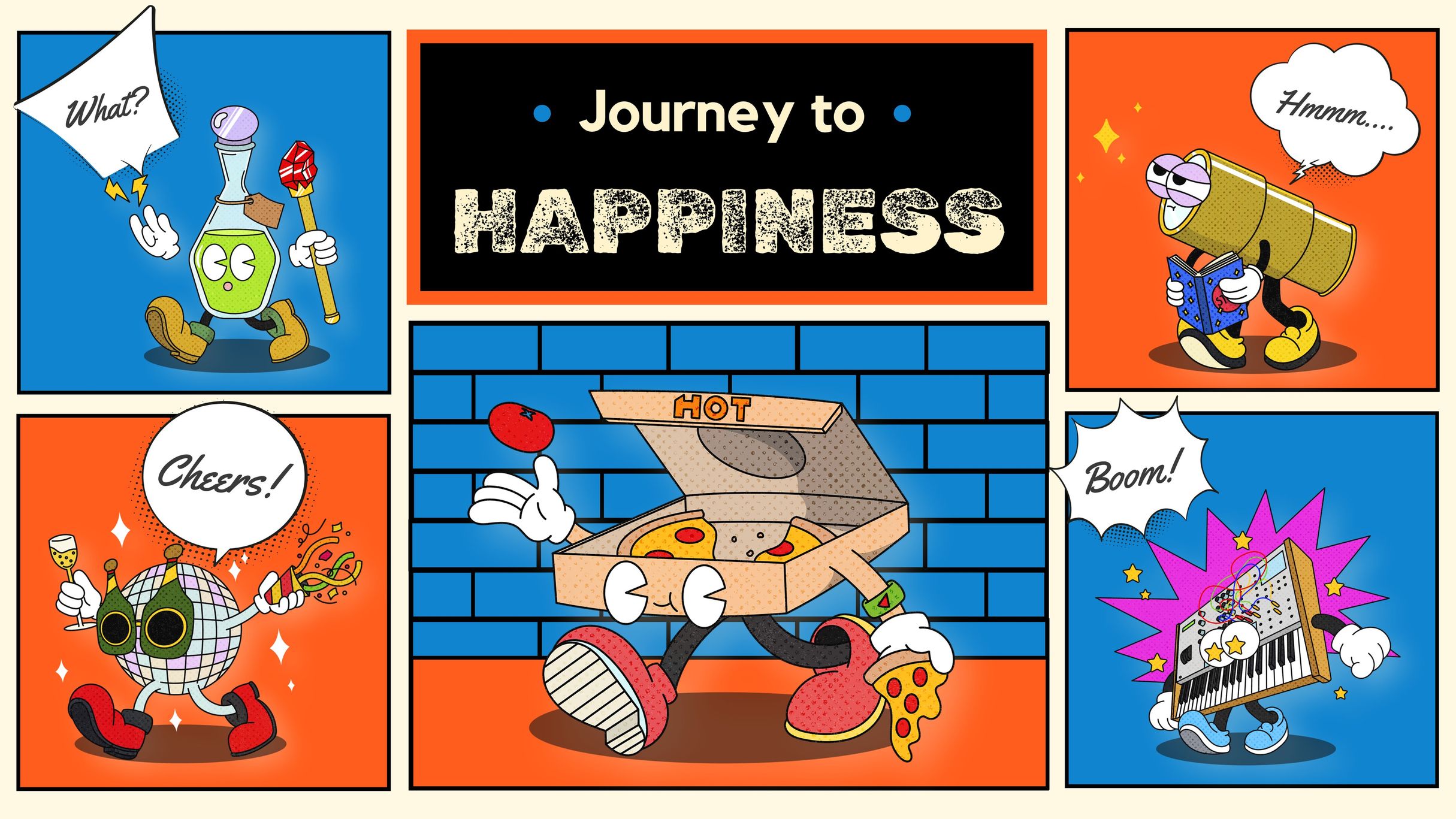
Pantone announces the Color of the Year annually. Pantone’s chosen Color of the Year provides inspiration for color selection across various industries, including designers, marketers, and more. Also creating YouTube thumbnails using Pantone colors can lead to eye-catching thumbnails.
-
2020: Classic Blue, 19-4052
")
Made by MiriCanvas
-
2021: Illuminating, 13-0647, and Ultimate Gray, 17-5104
")
Made by MiriCanvas
")
Made by MiriCanvas
-
2022: Very Peri, 17-3938
")
Made by MiriCanvas
-
2023: Viva Magenta, 18-1750
")
Made by MiriCanvas
-
2024: Peach Fuzz, 13-1023
One of the 2024 color trends will be peach fuzz.
")
Made by MiriCanvas
What colors mean
Each color carries its own meaning and significance.
-
Red: energy, power, passion
-
Orange: warmth, creativity
-
Yellow: happy, energy, light, wealth
-
Green: optimism, growth, nature, safety
-
Blue: cool, calm, trust, intelligence, conservative
-
Pink: youthful
-
Purple: cool, vibrant, ambition
How to combine colors
You can use solid colors, but you can also mix colors. Blend this year’s Pantone color with a hue that resonates with you to create a unique combination. And there are four primary methods for mixing colors.

Made by MiriCanvas
-
Complementary colors: Complementary colors, such as red and green or blue and orange, are opposites on the color wheel.
-
Monochromatic colors: Monochromatic colors consist of various shades and tones of a single hue. These color schemes create a visually harmonious effect.
-
Analogous colors: Analogous colors are adjacent to each other on the color wheel, such as red, orange, and yellow, or blue and purple.
-
Triadic colors: Triadic colors are evenly distributed around the color wheel and often result in vibrant and dynamic color palettes.
How to express your design using Pantone color
-
If you type your desired color into the search bar of the MiriCanvas, templates in your preferred color will appear.

Green templates in MiriCanvas

Blue templates in MiriCanvas
-
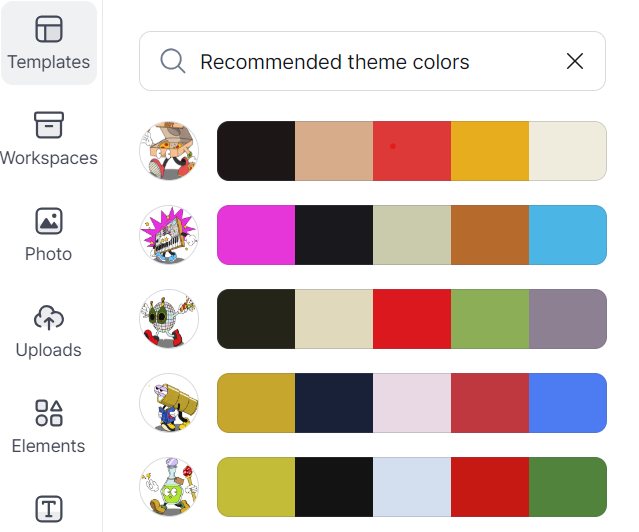
Alternatively, you can first choose a template that you like and then easily change the colors using MiriCanvas theme colors. Using this feature, you can also find your own brand colors and brand identity.

Try blending Pantone colors with other hues!
-
You can also extract colors from your desired images. Once you have prepared the image, uploading it to MiriCanvas will automatically generate photo theme colors.
Made by MiriCanvas
-
And if you want to design using Pantone colors but are unsure about the specific Pantone colors, you can easily search using MiriCanvas AI writing tool without the need for separate Google searches. Simply create a text box, click on the AI writing feature, and ask questions just like you would with ChatGPT. Within a minute, you’ll obtain the information you need.
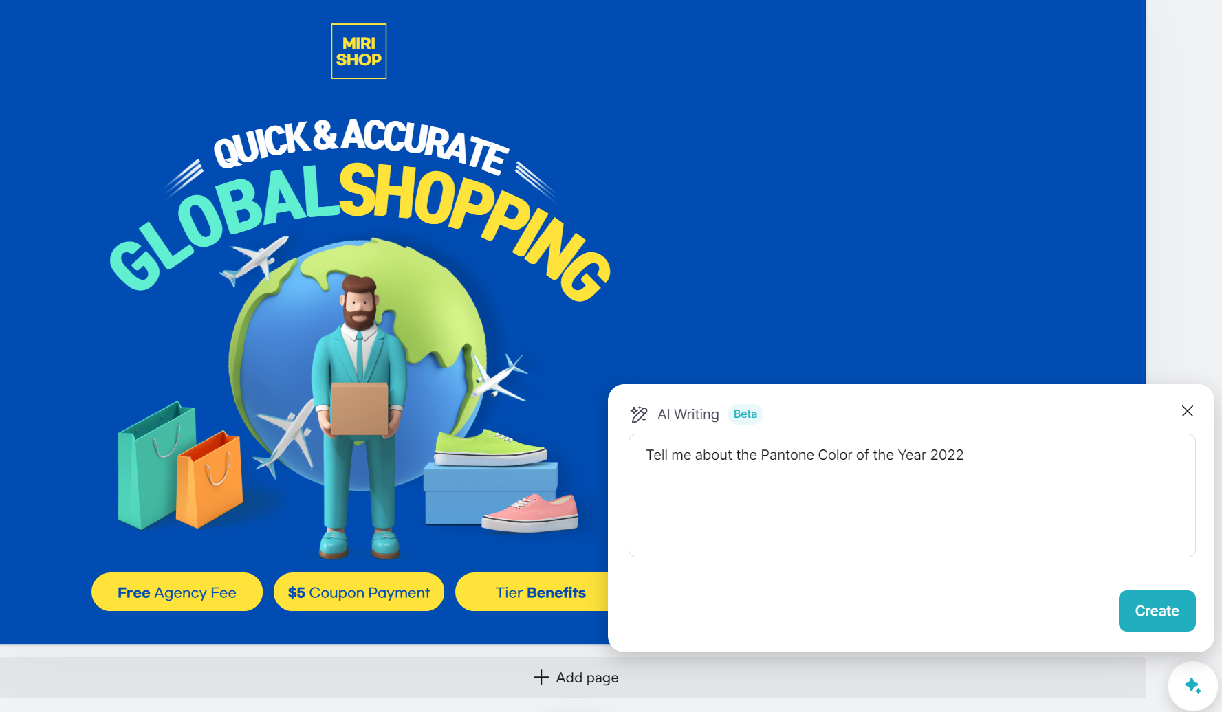
Try using the AI feature on MiriCanvas
Show your design colors
When choosing colors for your design, it’s important to consider your design objectives first. Think about what you’re creating and then use the color combinations or palettes suggested earlier. If you’re looking for color references, you can explore Pinterest or browse through MiriCanvas templates. You might discover more interesting color combinations than you initially knew.
MiriCanvas is a website for small business owners that makes it easy to find the colors for their brand. You can try MiriCanvas Pro subscription for one month free if you just sign up, or you can use the free version if you’re not ready for the Pro subscription. MiriCanvas is recommended as a Canva alternative, so you shouldn’t have any trouble using any plan.
If you want to gain various insights related to design and marketing, check out articles on the MiriCanvas Global Blog. And if you’re interested in hearing stories about design tips for using MiriCanvas, visit the MiriCanvas global Instagram account.