- Templates
- Data
Data templates
Style
Color
Reset filter


Data Templates by MiriCanvas
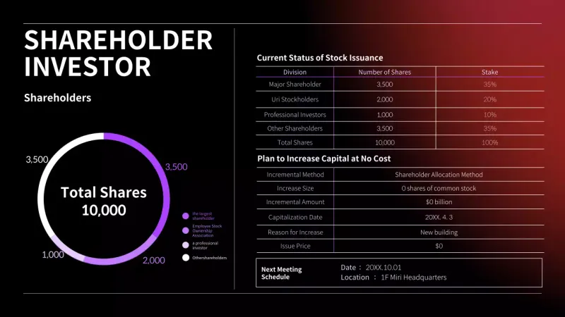
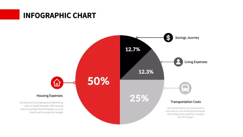
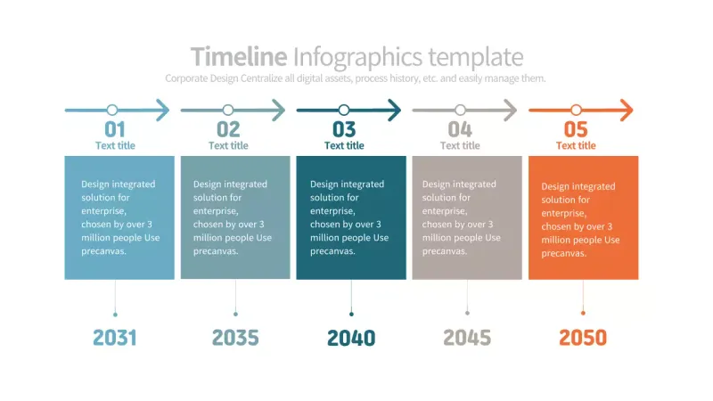
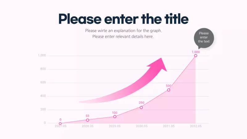
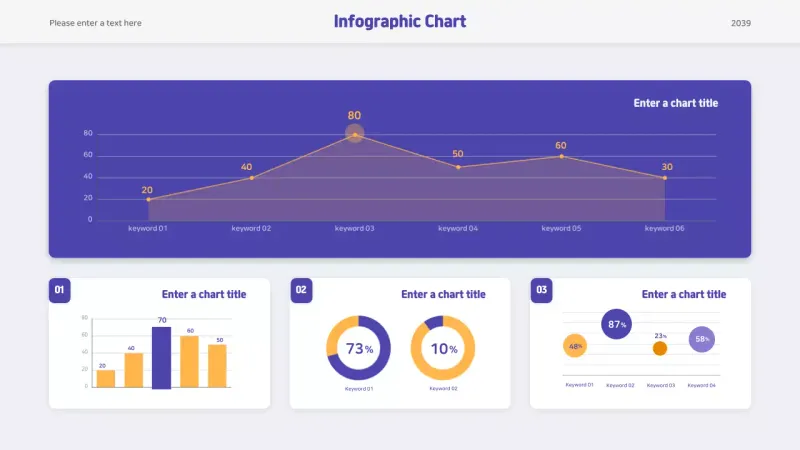
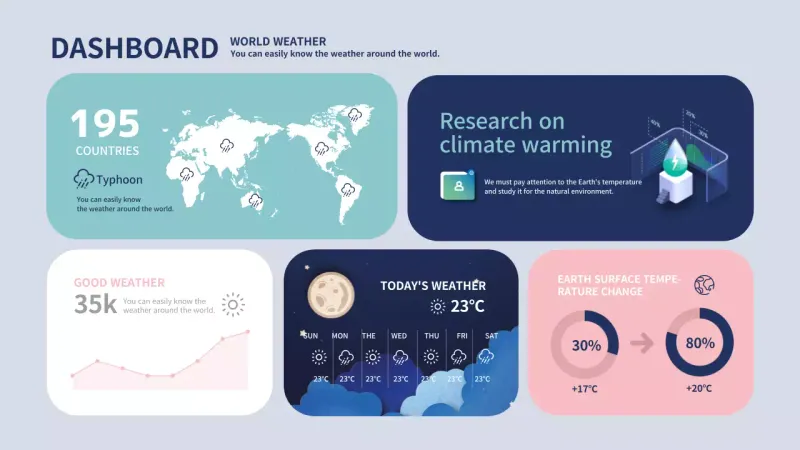
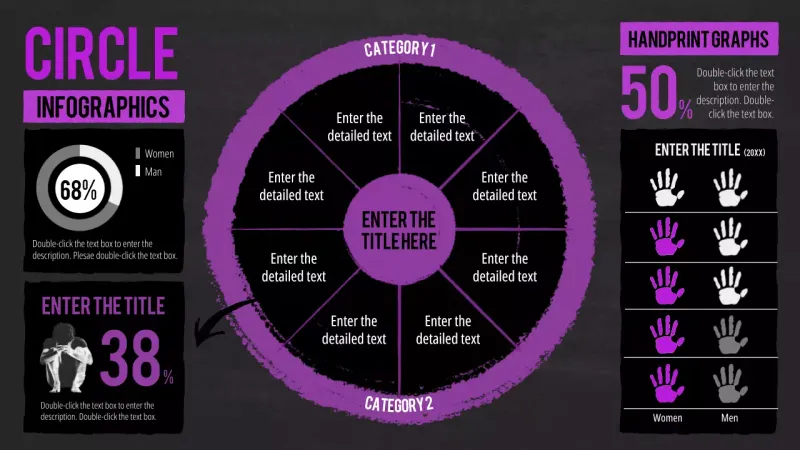
Transform Complex Data into Compelling Visual Stories Turn raw numbers into powerful visual narratives with MiriCanvas's data visualization templates. In today's data-driven world, effectively communicating complex information is crucial for making informed decisions. Our templates help you create professional charts, graphs, and infographics that make your statistics instantly understandable. Whether you're preparing a business report, academic presentation, or marketing analysis, the right visualization makes all the difference. Choose from various styles—clean bar charts for comparisons, dynamic line graphs for trends, intuitive pie charts for proportions, or revealing scatter plots for correlations. MiriCanvas makes it easy to follow best practices in data visualization. Our templates guide you to maintain proper scaling, include clear labels, and use color purposefully to highlight key insights without distortion. Avoid common mistakes like overcomplicated visuals or inappropriate chart types that can misrepresent your metrics. For financial data, scientific research, marketing analytics, or educational content, we offer specialized designs that match your specific needs. Our AI-powered tools can even suggest optimal visualization formats based on your data type. Create impactful, accurate, and visually appealing data stories that resonate with your audience and drive better understanding. With MiriCanvas, you can transform complex information into clear visual communication—no advanced design skills required.