
Tools

AI資料作成
AIプレゼンテーション
BEST
AI文章作成·作文
AI ポスター
AIかんたん作成
AI画像生成
AI動画生成
HOT
AI キャラメーカー
AI アイコン作成ツール
AI アイコンメーカー
AIイラスト生成
AI ロゴメーカー
AI フリー背景素材
AIクイック編集
AI画像編集
背景除去
高画質化
写真イラスト化
HOT
New!

イラスト一覧を見る
幅広いシーンで使える高品質イラストをご用意しています。
Plans


You can create bar charts using Miricanvas's chart and graph features.
Input your data, and a ready-to-use graph for your reports or presentations will be generated. Choose a template you like and get started quickly. You can freely edit colors, fonts, and even layouts with just a few clicks.
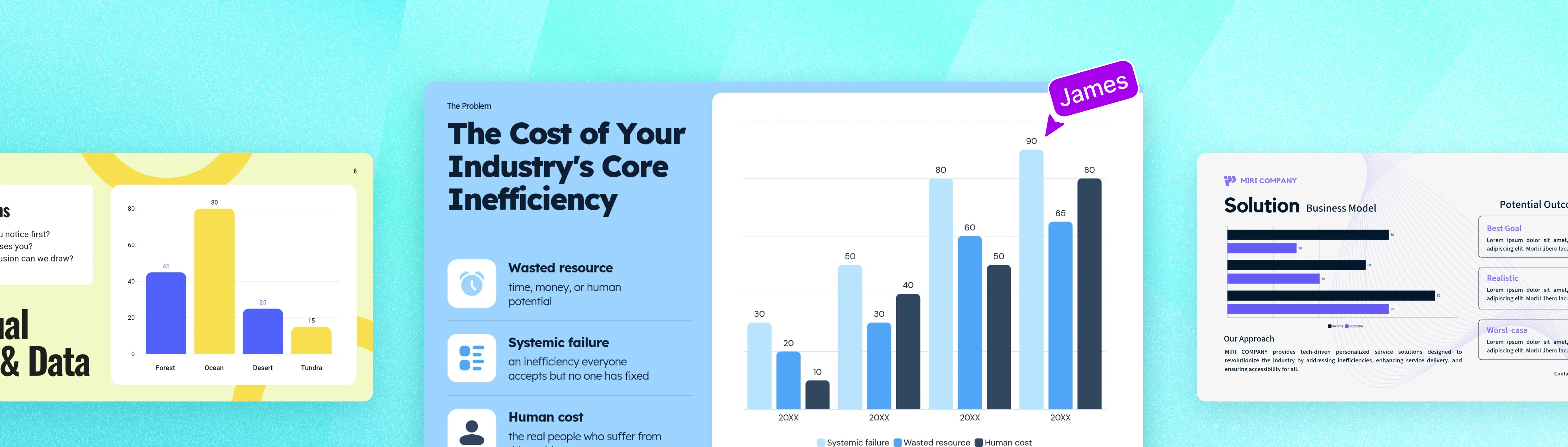
No need to learn complex usage. From data entry to design editing,
create your own bar chart in Miricanvas.




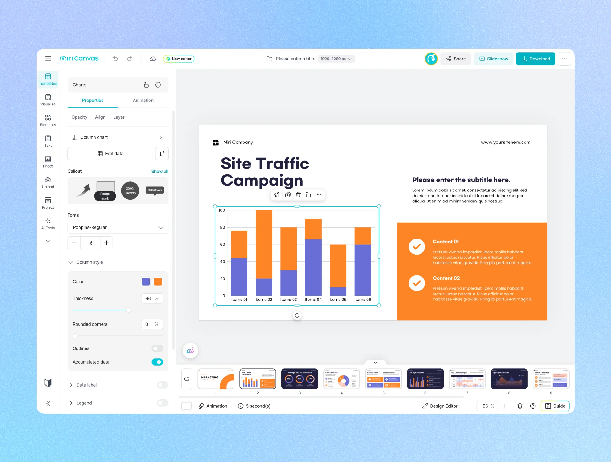
Start with a Template: Search for "Bar Graph" in the [Templates] menu on the Miricanvas website, or in the [Templates] menu on the left side of the editor after clicking [Create Design].
Start with a Chart: From the [Chart] menu on the left side of the editor, you can select and immediately add your desired style of bar graph.
If you started with a [Template], select a design that suits your purpose, such as a report or PPT. Narrowing down the options with terms like 'Presentation' or 'Vertical Document Format' will help you find the desired template faster. If you started with a [Chart], you can skip this step.
Bar charts are tools that visualize numerical data using bars, making it easy to compare the magnitudes of different items at a glance. Because longer bars intuitively represent larger values, they allow for a much quicker understanding of differences compared to a table of mere numbers. They can be oriented horizontally or vertically depending on the nature of the data, and are also referred to as bar charts.
Consider using bar charts in these situations:
- When comparing the magnitudes of different items side-by-side, such as sales volume by product or performance by department.
- When observing changes over specific time units, such as annual or monthly figures.
While numbers present facts, they alone often struggle to persuade. Bar graphs visually highlight differences and trends between items,delivering the data's message more quickly and clearly.
Adding design further enhances persuasiveness. Graphs unified by brand colors,
and layouts that visually emphasize key items instill trust in the viewer, making the insights within the data stand out even more. Create bar graphs and custom designs, all in one go, with Miricanvas.
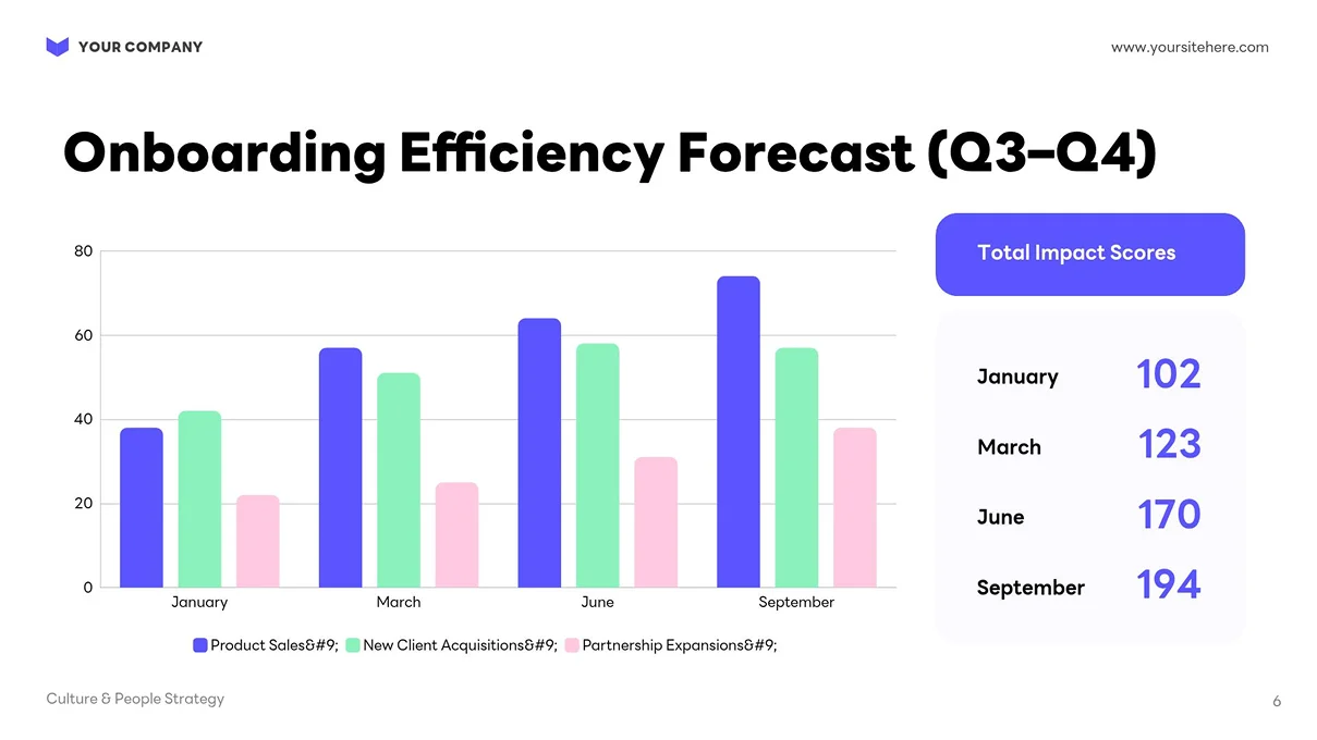
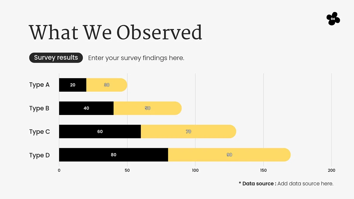
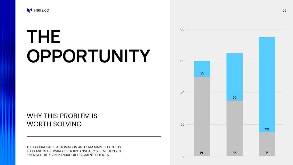
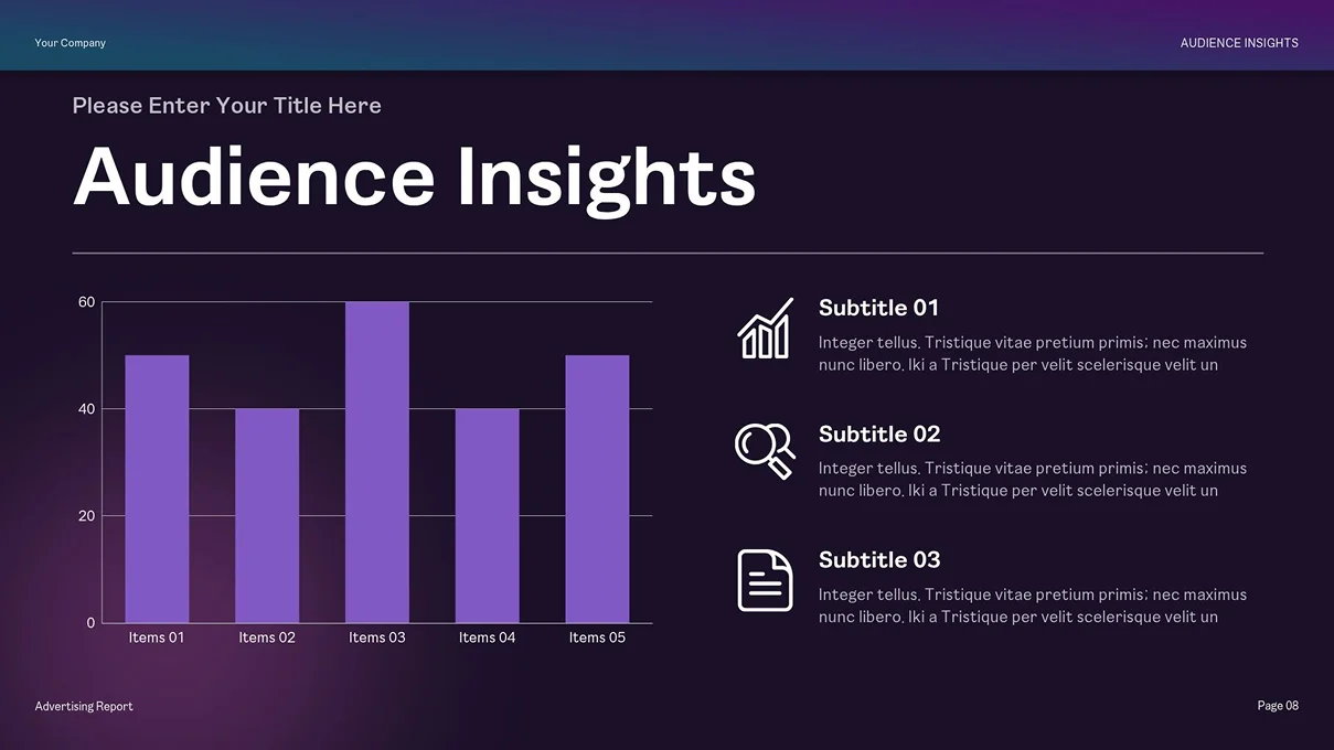
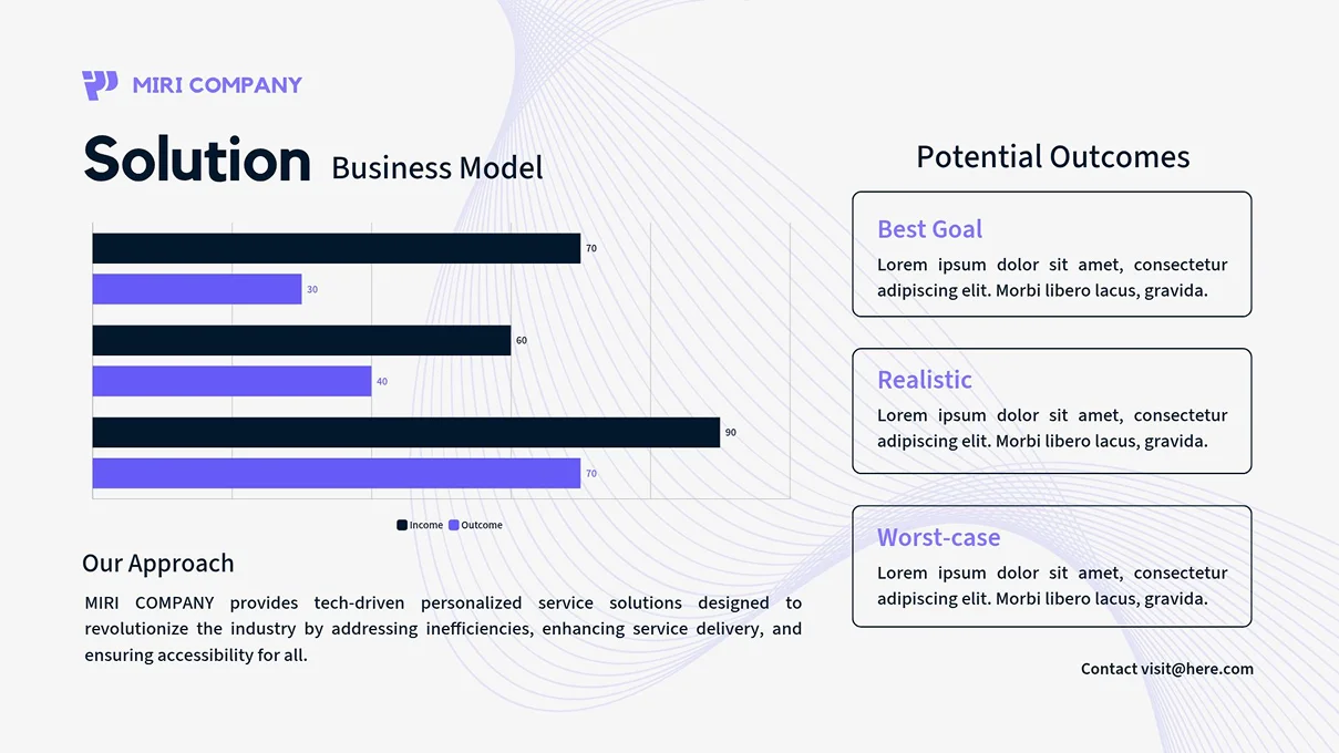
Input your values, and your bar chart is instantly ready. Copying and pasting data from Excel or Google Sheets saves you the hassle of re-entering it from scratch. You can choose the bar chart type that best suits your data – vertical, horizontal, or stacked – or switch between types at any time.
If you want to view two different datasets together on one screen, try using a 'combo chart.' For instance, it can visually connect two metrics with entirely different units or scales, such as departmental labor cost breakdown (stacked bar) and operating profit margin trends (line), within a single graph.

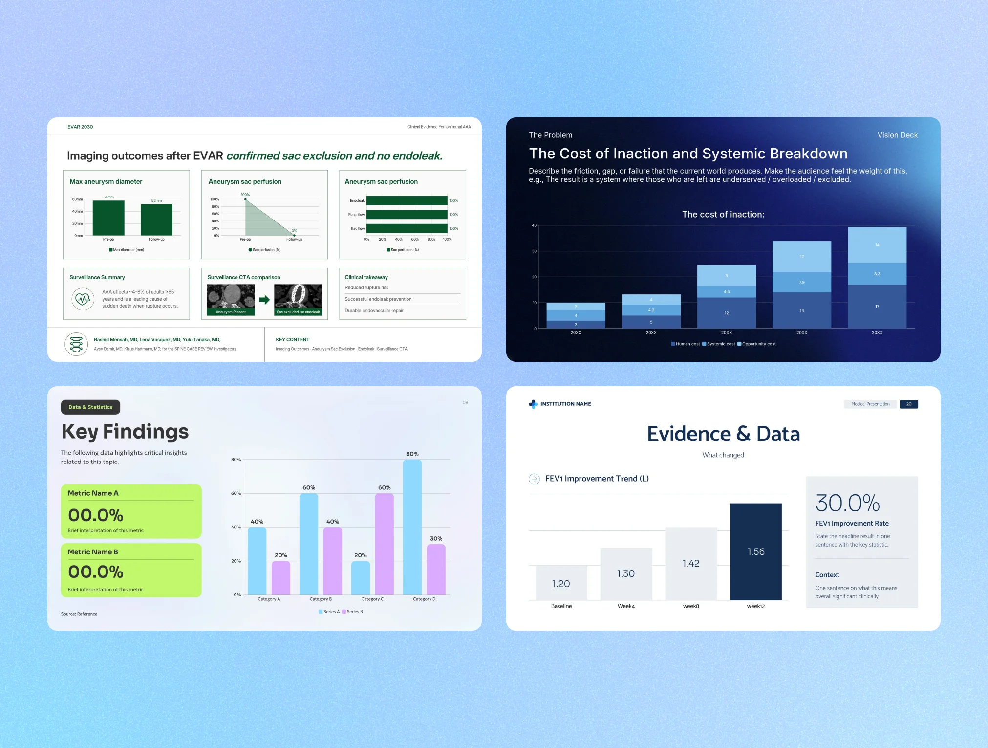
No need to start from scratch. Simply choose a bar chart template that suits your purpose, add your data, and instantly get a polished design. Explore templates for reports, presentations, infographics, and more.
Want to highlight specific data points? Add emphasis elements. By overlaying arrows, range markers, illustrations, and more onto your graph, you can instantly draw attention to the key insights you want to convey.
No need to stick to templates. You can individually adjust every element: data label colors, gridline styles, bar colors for each item, legend position, and font type and size. Want to highlight a specific bar by changing its color or remove unnecessary axis labels? It's just a few clicks away. There's no steep learning curve – simply select your desired option in the settings window.

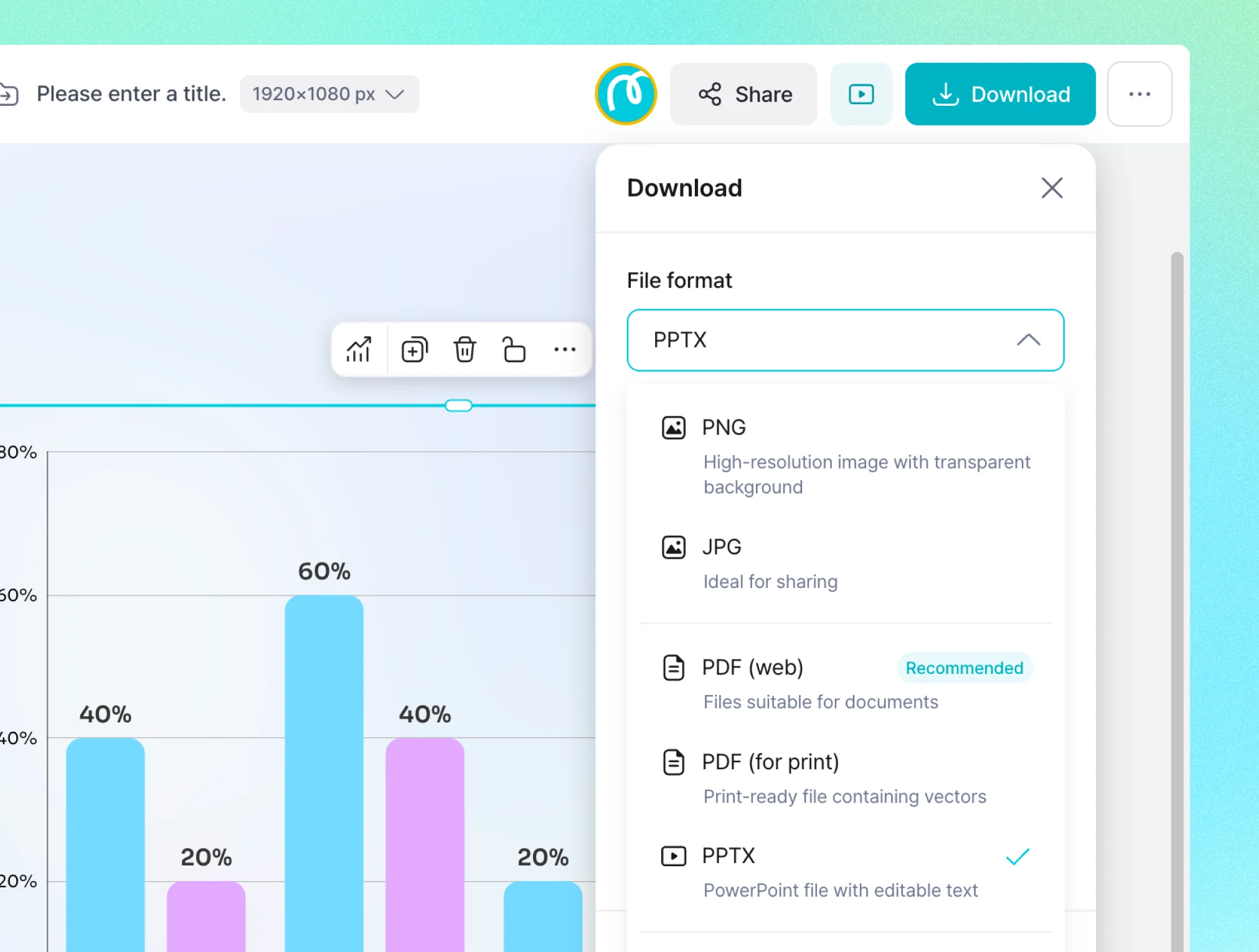
You can instantly export your completed graph in your desired format, such as PNG, JPG, PDF, or PPTX. You can insert it into presentation slides, paste it into reports, or share it via a link, all without any separate conversion steps. From creation to immediate use, you can do it all in one go.
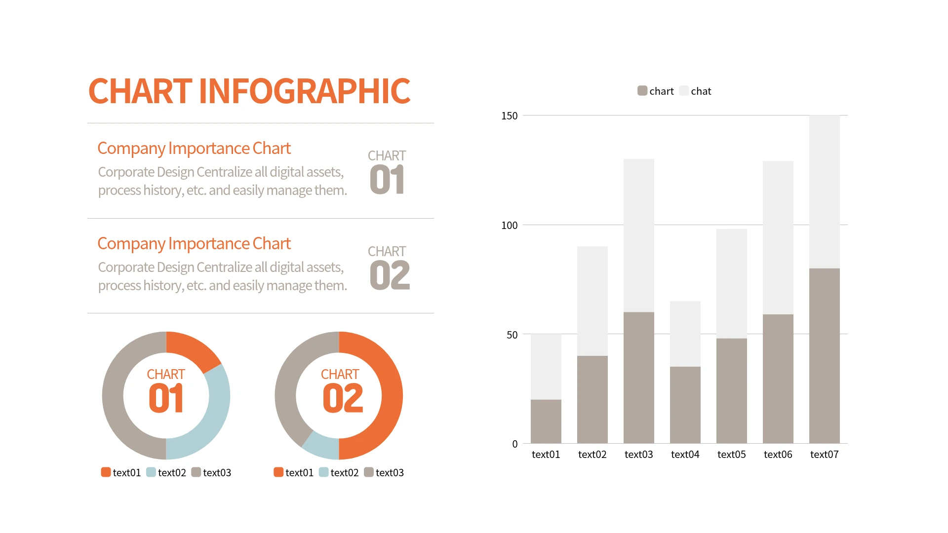
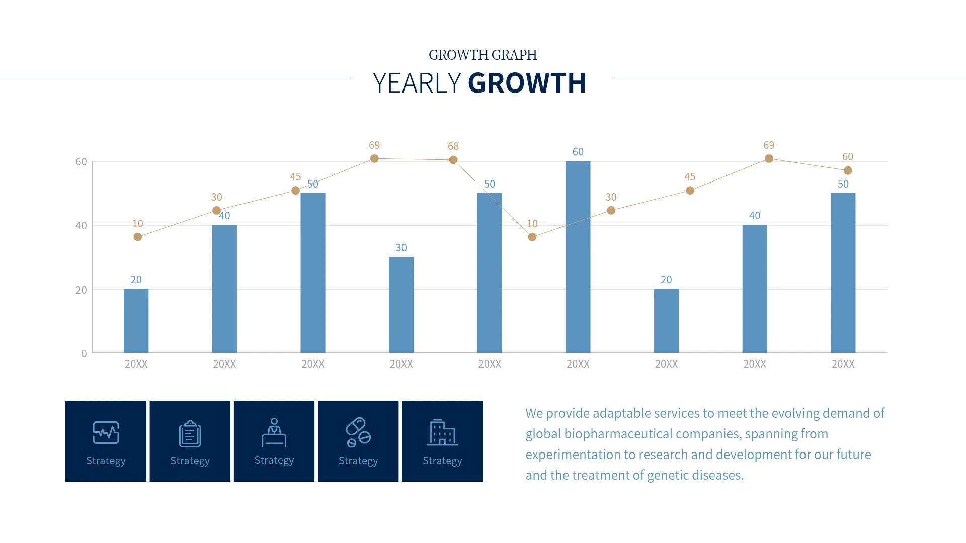
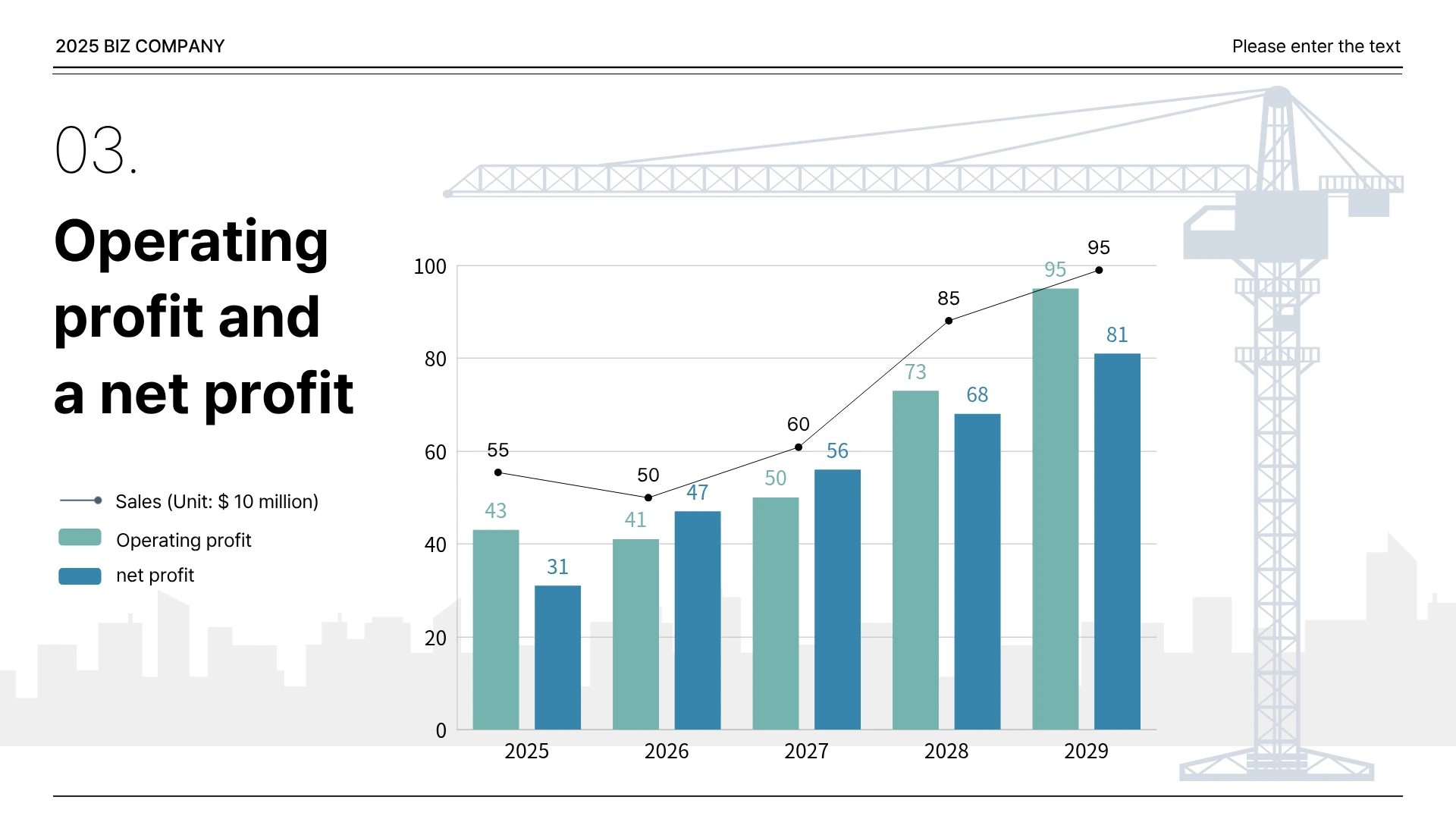
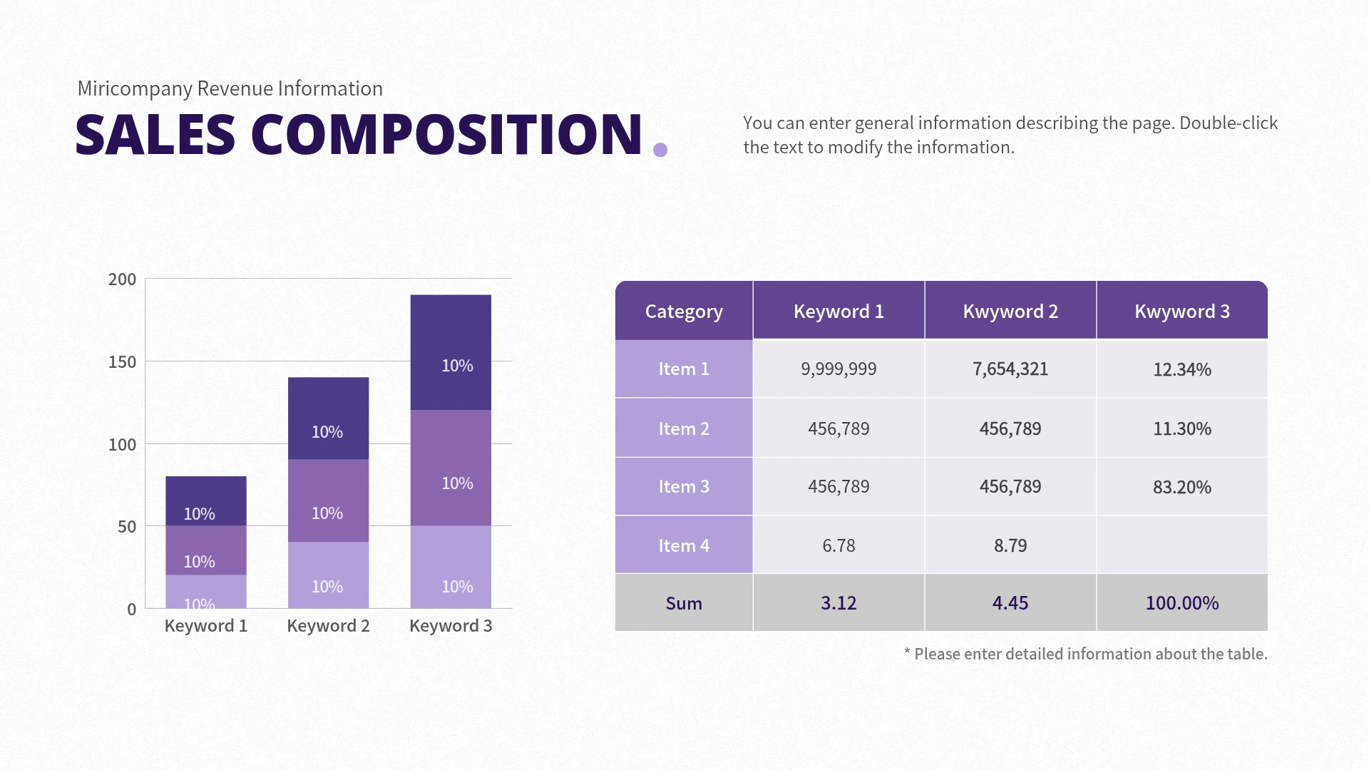
Whether for reports, presentations, or infographics, you can choose a bar graph design that suits your purpose and get started right away. You can freely edit the template even after importing it.
.webp)
.webp)
.webp)
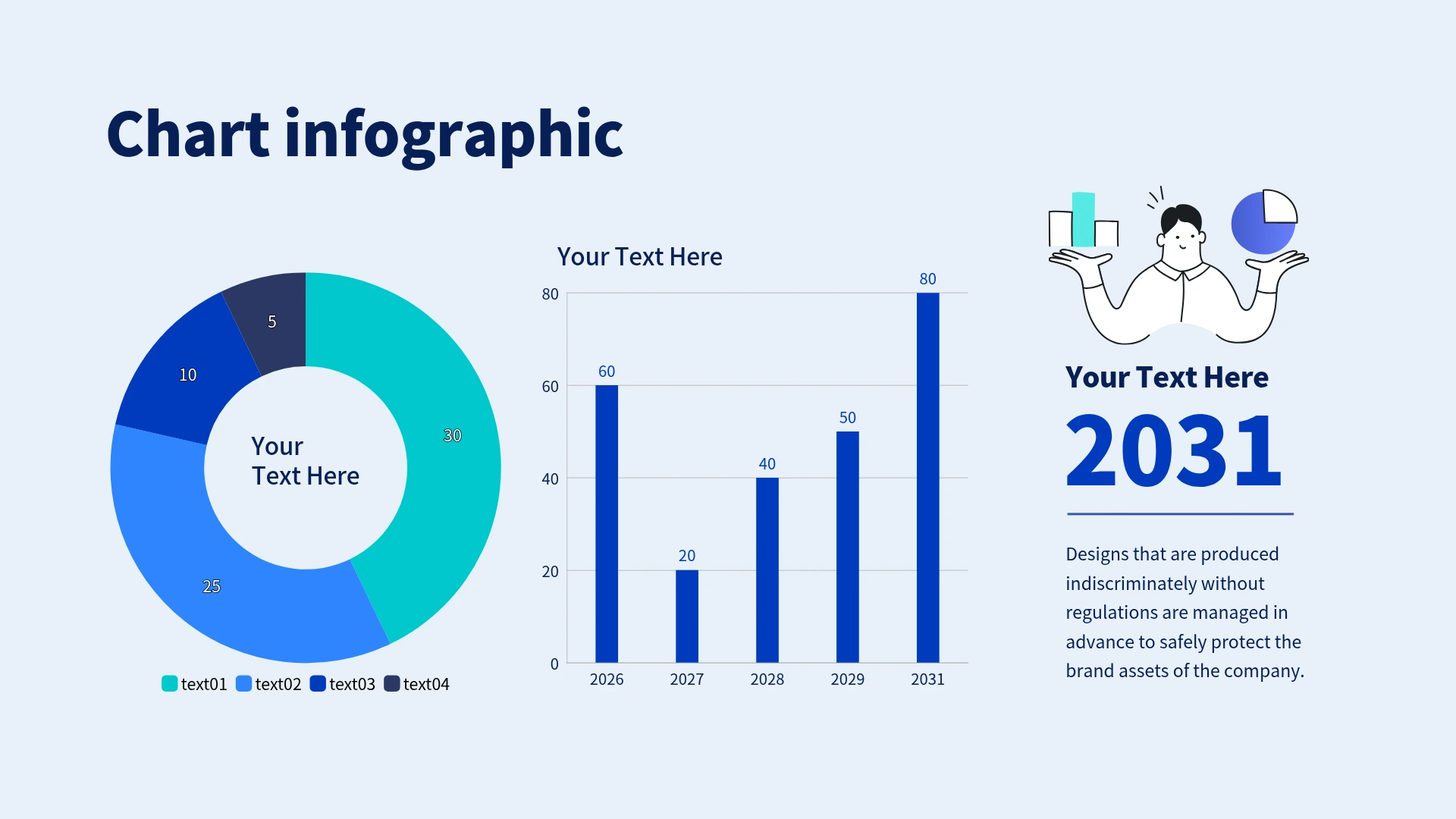

Simply choose a template you like and input your data. Adjust colors and layouts with just a few clicks. Get started for free with Miricanvas. You can also create various other chart types like line graphs, pie charts, and area charts using the same easy process.



