
Tools

AI資料作成
AIプレゼンテーション
BEST
AI文章作成·作文
AI ポスター
AIかんたん作成
AI画像生成
AI動画生成
HOT
AI キャラメーカー
AI アイコン作成ツール
AI アイコンメーカー
AIイラスト生成
AI ロゴメーカー
AI フリー背景素材
AIクイック編集
AI画像編集
背景除去
高画質化
写真イラスト化
HOT
New!

イラスト一覧を見る
幅広いシーンで使える高品質イラストをご用意しています。
Plans


Make a line graph with MiriCanvas's chart feature. Enter your data and you'll have a graph that's ready to drop into a report or presentation. Pick a template you like to get started fast, and edit the colors, fonts, and layout freely with just a few clicks.
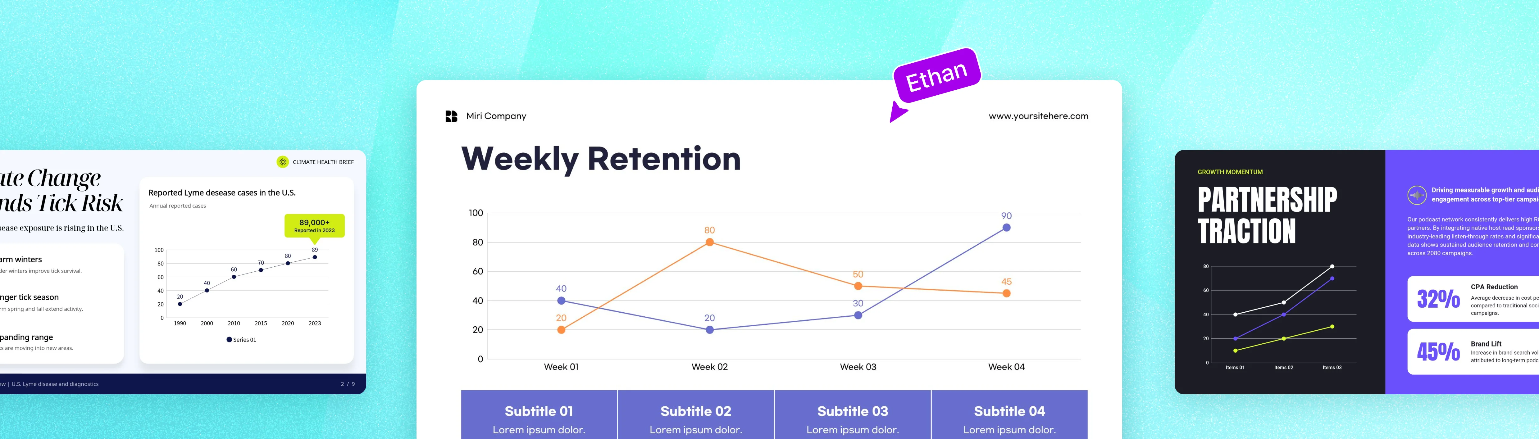
There's no complicated workflow to learn. From entering your data to editing the design, make your own line graph from start to finish in MiriCanvas.




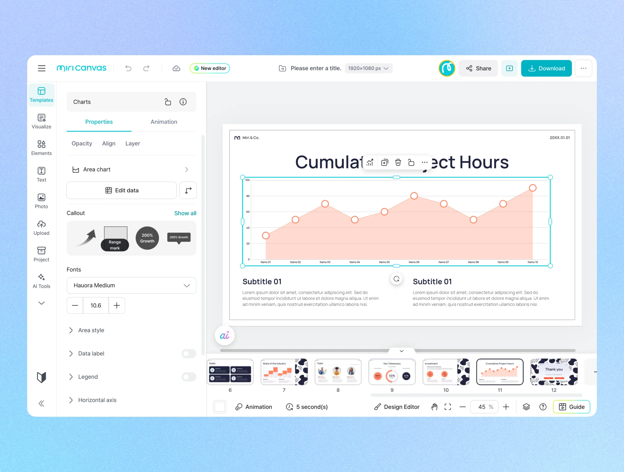
Start from a template : Start from a template: Open the [Templates] menu on the MiriCanvas site, or click [Create a design] and search "line graph" in the [Templates] menu on the left of the editor.
Start from a chart: Select the line graph style you want from the [Chart] menu on the left and add it straight in.
If you started from [Templates], pick a design that fits your purpose, such as a report or presentation. Narrowing by "Presentation" or "Vertical Document" helps you find the right template faster. If you started from [Chart], you can skip this step.
A line graph plots your data values as points and connects them with a line to show how things change.
Just by looking at where the line rises and falls, you can see at a glance when values went up or down. It's the chart type that fits best for data that changes continuously over time, like temperature shifts, sales trends, and population movement.
Change is hard to convey with numbers alone. The more values you add, the harder a table is to read, and people have to compare the figures themselves. A line graph sums up that flow in a single line, so anyone can read when things rose and fell right away.
Add design on top, and that persuasive power grows. A graph organized in consistent colors, with a layout that puts the key stretch front and center, earns trust from your audience and makes the message in your data sharper.
Make your line graph and customize the design all in one place with MiriCanvas.

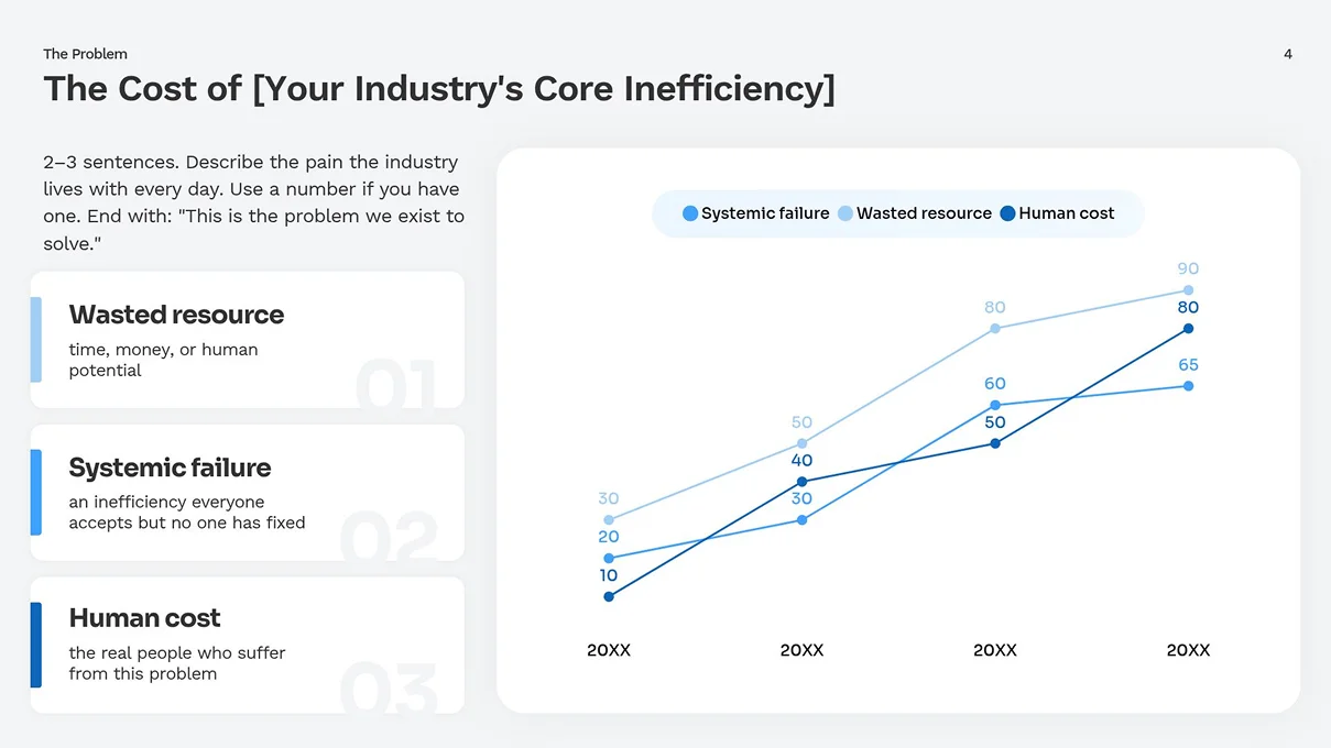
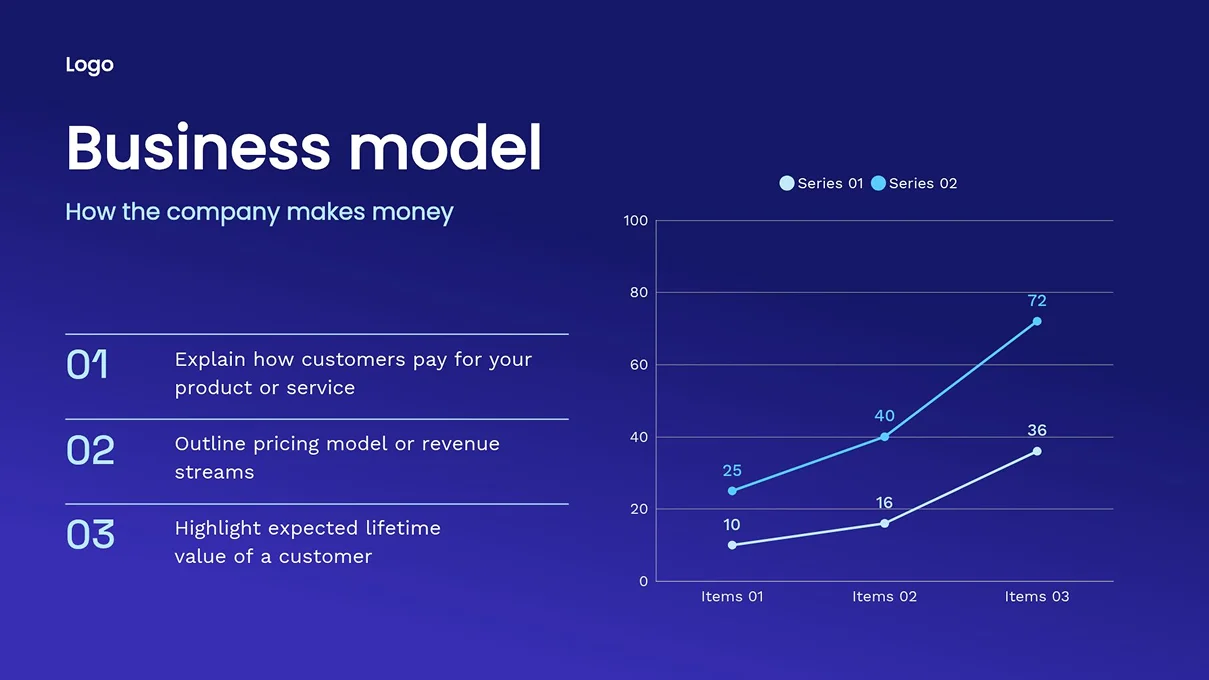
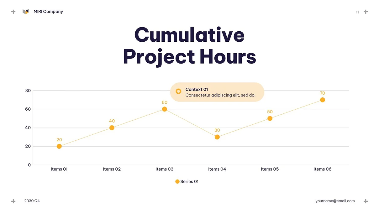
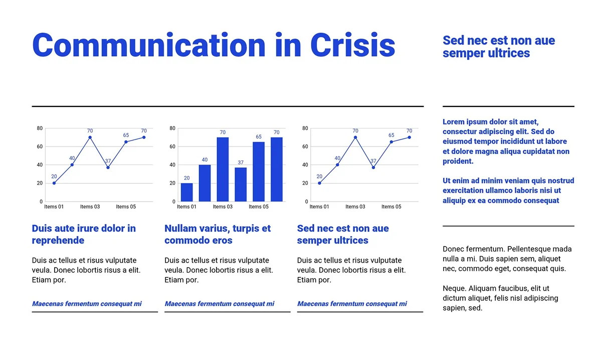

Enter your values and the line graph comes together right away. Copy data from Excel or Google Sheets and paste it in to skip retyping from scratch. Comparing several items? Add more lines to make a multi-line graph.
Want to see two different kinds of data on one screen? Try a combo chart. For example, you can connect two metrics with different units or characters in a single graph, like monthly visitor trend (line) and traffic share by channel (bars), or sales growth (line) and cumulative volume (area).
You don't have to build from scratch. Pick a line graph template that fits your purpose and just add your data to put a polished design to work right away. Browse templates for reports, presentations, infographics, and more. Want to emphasize a particular stretch? Add a highlight element. Layer arrows, range markers, or illustrations over your graph to point straight to what you want people to notice.
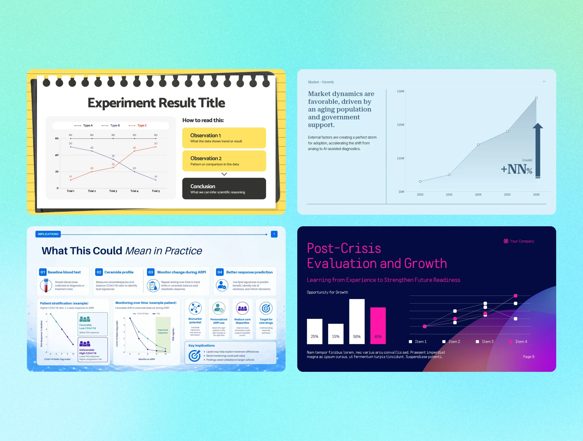

You don't have to use a template as-is. Adjust line color and thickness, data label placement, legend style, axis ticks, and fonts, all item by item. Recoloring a single line to highlight it, or changing how values are shown, takes just a few clicks. There's nothing extra to learn, just select what you want in the settings panel.
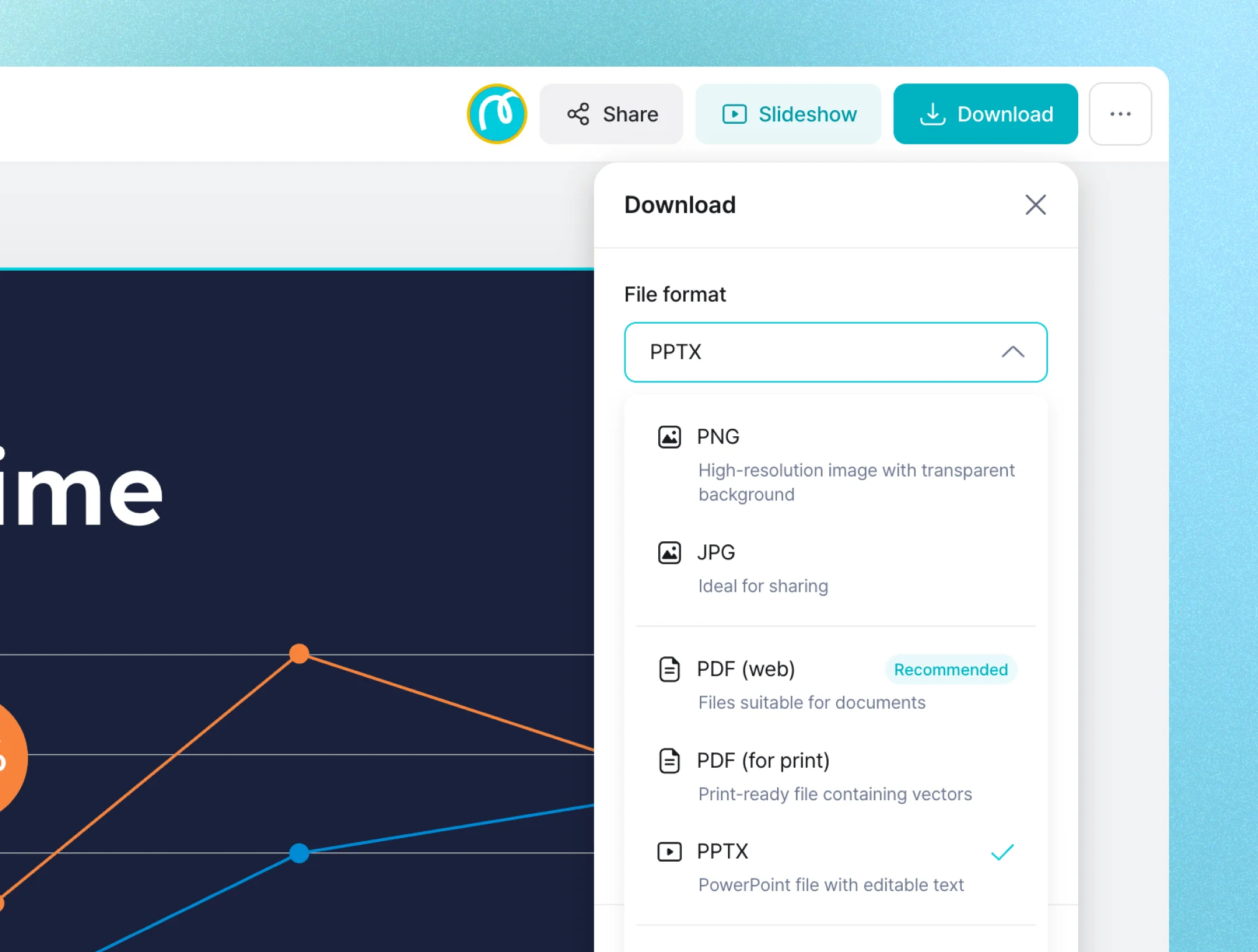
Export your finished graph as PNG, JPG, PDF, PPTX, and more, right away. Insert it into a presentation slide, paste it into a report, or share it with a link, all with no conversion step. From creating it to putting it to use, you can finish in one place.
Pick a line graph design for your purpose and start right away. Every template stays fully editable after you bring it in.
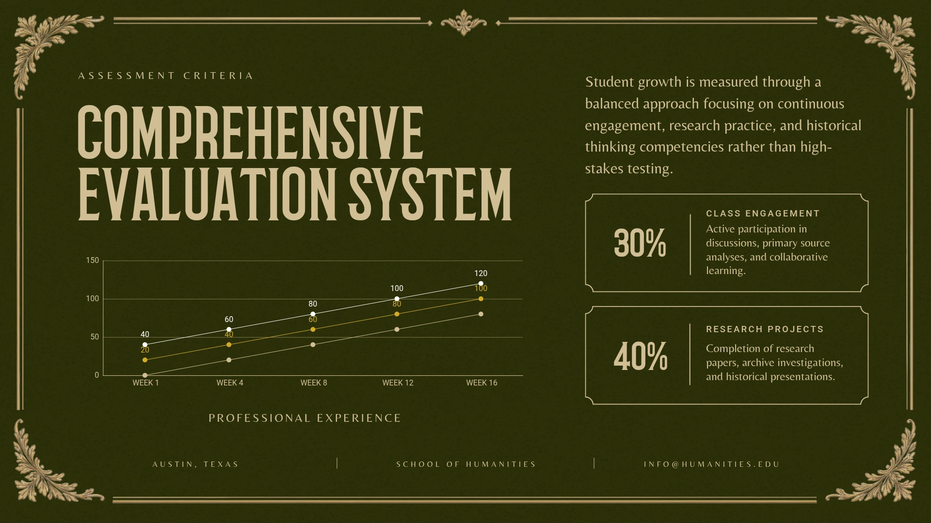
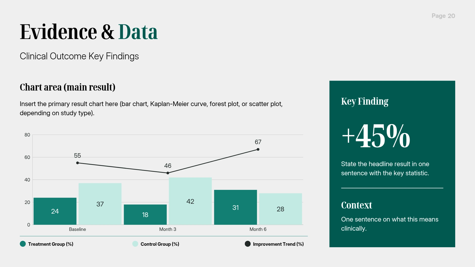
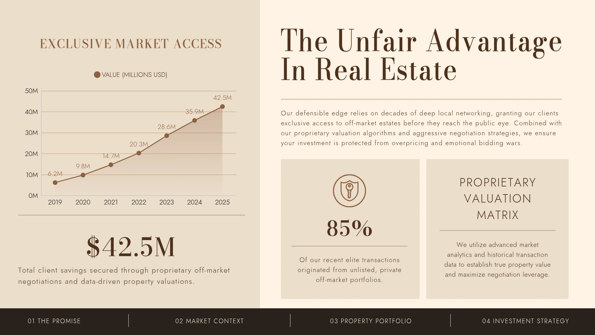
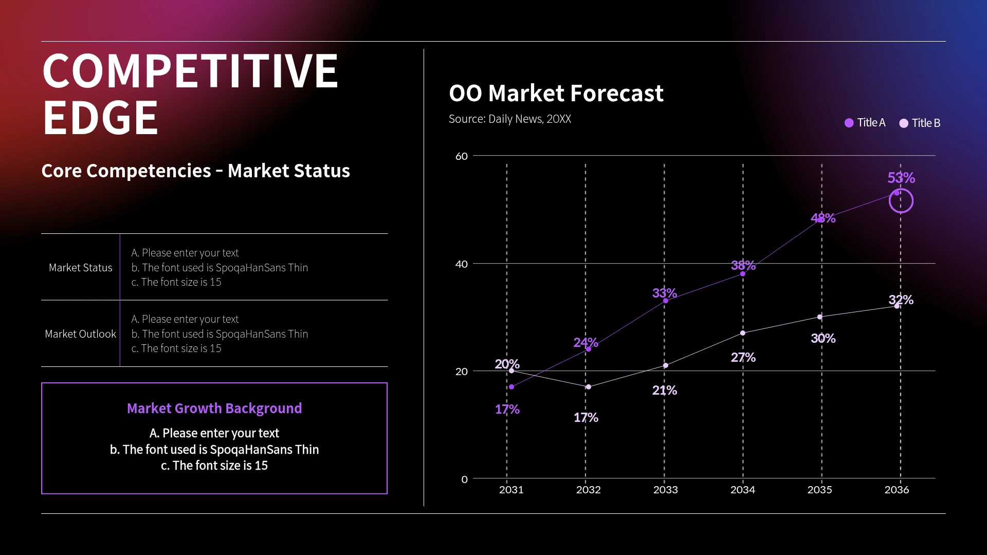
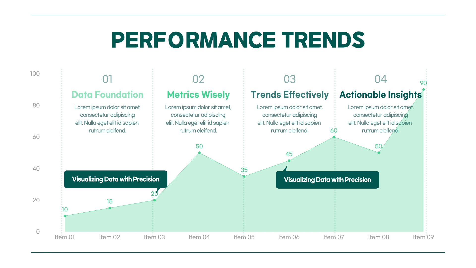
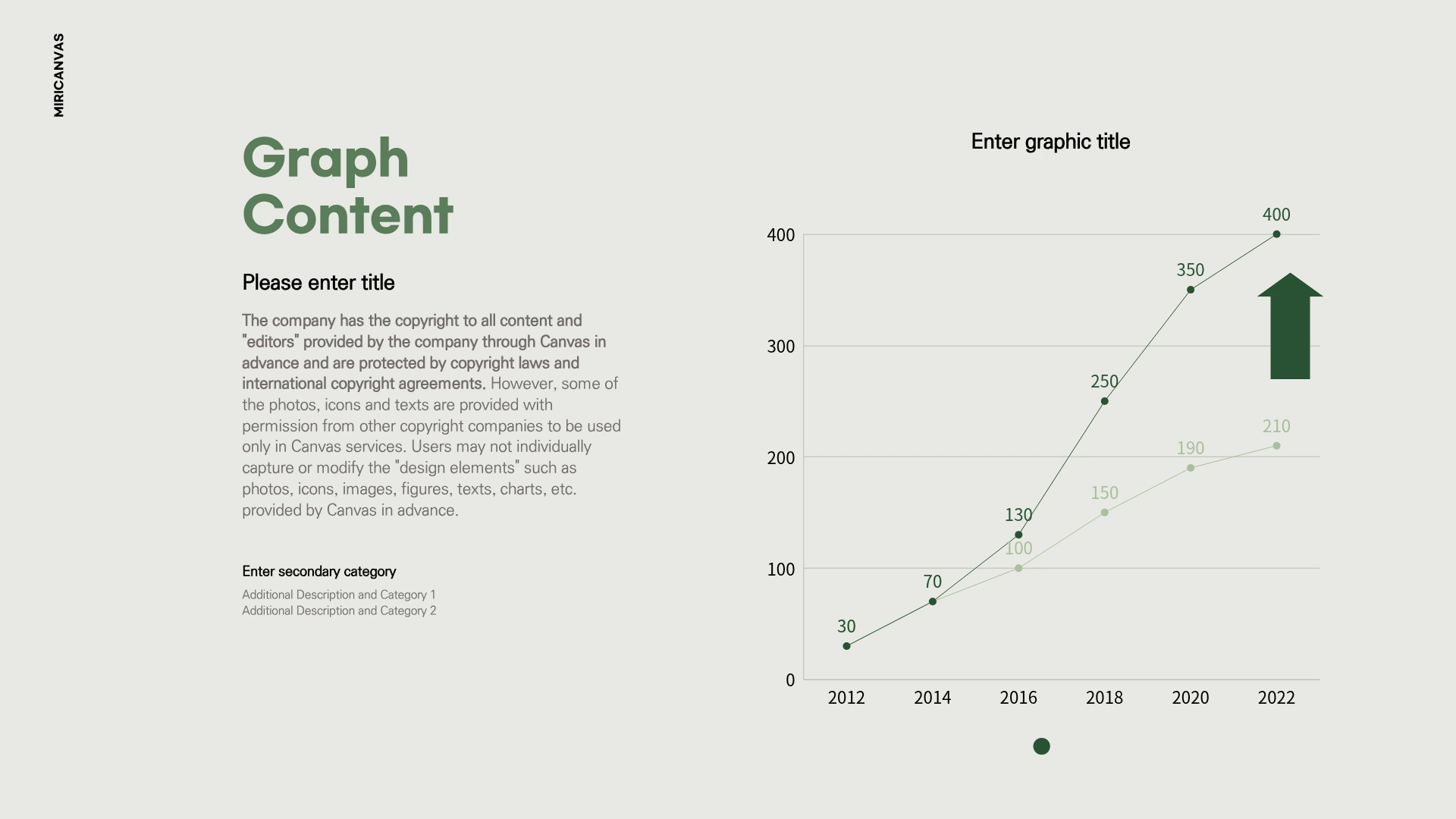
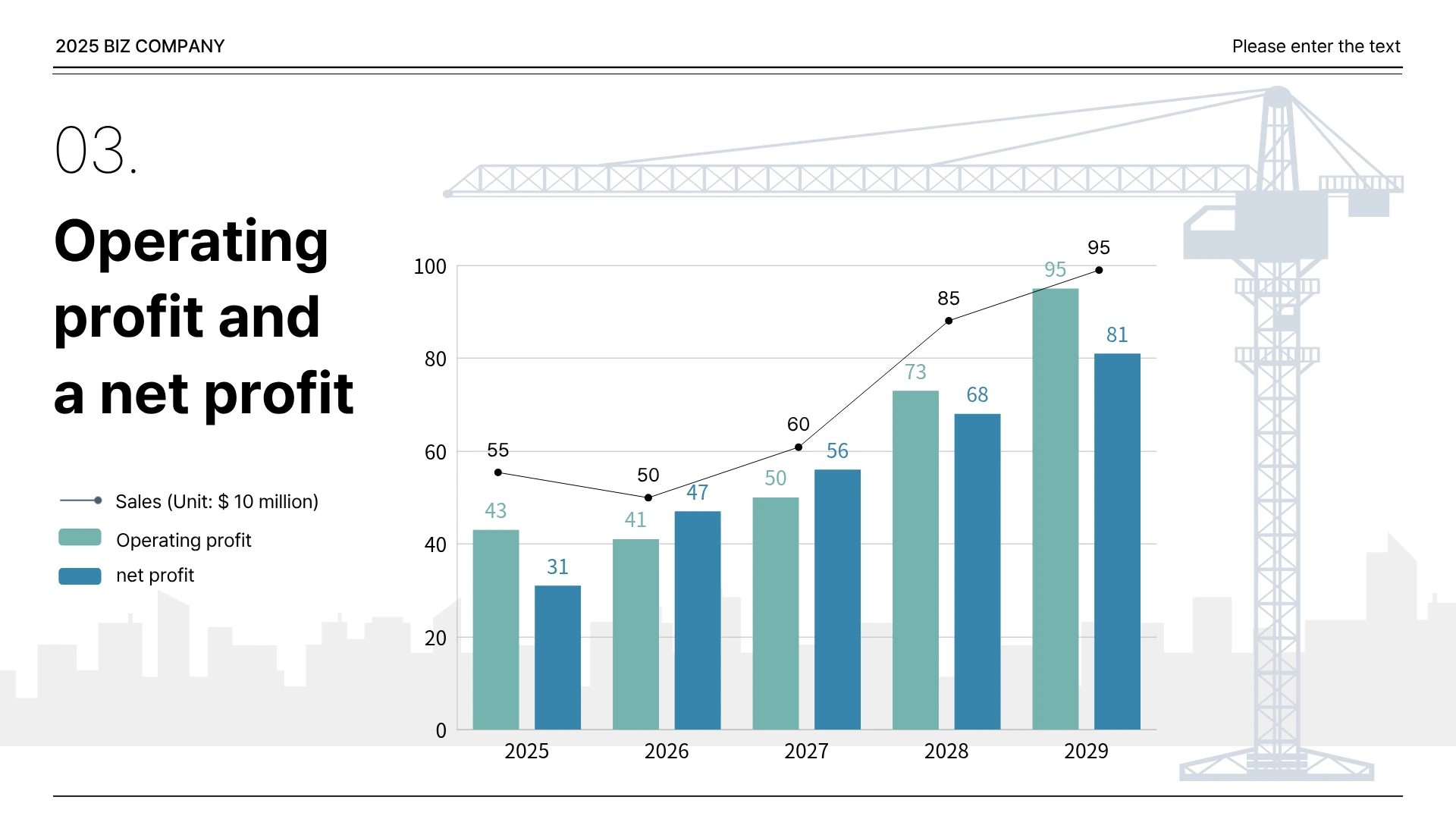
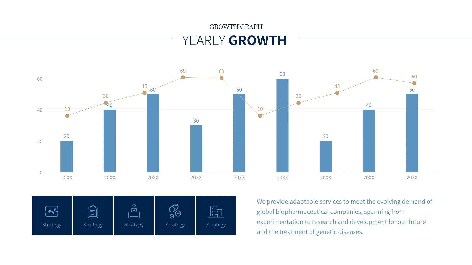

A line graph fits best when you want to show how a value changed over time. The shape of the line rising and falling tells the direction of change on its own, so people can read the flow without comparing every number.
Reach for one in situations like these:
- Showing natural phenomena that change continuously by time, like temperature or rainfall.
- Showing the trend of business metrics, like monthly or quarterly sales and visitor counts.
- Explaining long-term change, like population shifts by year or rising prices.
- The slope of the line also tells you at a glance whether values are climbing fast or easing down. It's useful for gauging where things might head next, based on the flow of past data.
If you're drawing a line graph by hand, follow these steps.
- Set the x and y axes: Put time (months, years, and so on) on the x-axis and the value you're measuring (quantity, amount, and so on) on the y-axis.
- Set the scale: Choose a scale size and interval that can hold your data's maximum value.
- Plot the points: Mark each data value as a point where the x and y axes meet.
- Connect the lines: Join the points in order with line segments.
- Use a break line: If too much empty space opens up at the bottom of the y-axis, use a break line (axis break) to compress it so the change reads more clearly
- A digital tool makes this far faster. In Excel, select your data and choose [Insert] → [Chart] → "Line" to generate the graph. Google Sheets works the same way.
- That said, Excel and Sheets are limited when it comes to fine-tuning details like color, fonts, and layout. In MiriCanvas, the graph comes together just by entering your data, and you can edit line color, thickness, and label placement in a few clicks. If you want to finish creating and designing your graph in one go, give MiriCanvas a try.
Both are charts that visualize data, but they suit different situations.
- A line graph is good for showing change over time. Its strength is seeing when values rose or fell, and which way the overall trend is heading.
- A bar graph is good for comparing sizes between items. It reads better when you line up values from different items side by side, like sales by department or units sold by product.
- For example, if you want to compare this month's sales by region, use a bar graph. If you want to show how sales changed over the past year, use a line graph.
The line graph has many variations. You can adapt it into different forms depending on the nature of your data and the message you want to send.
- Area chart: Fills the space under the line with color. Use it when you want to show the flow of change along with the scale of the accumulated amount.
- Flowchart: A diagram that connects the flow of data or work step by step. It's most often used to visualize a process or decision path.
- Radar chart: Arranges several evaluation criteria in a radial layout and connects the points into a polygon. Use it to compare one subject's strengths and weaknesses across multiple measures at once.
Yes, you can make line graphs on the free plan. You also get free access to over 50,000 templates and over 350,000 photos and graphics. If you want premium templates and AI features too, upgrade to the Pro plan. You can see the details on the pricing page.
Yes. Once your line graph is complete, export it as a PPTX file and open it directly in PowerPoint. If you’d prefer to build the entire presentation in MiriCanvas, you can also try the AI Presentation Maker.
Pick a template you like and just enter your data. Colors and layout adjust with a few clicks. Start free in MiriCanvas.



