
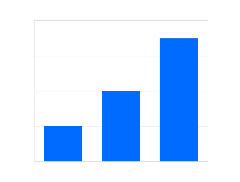
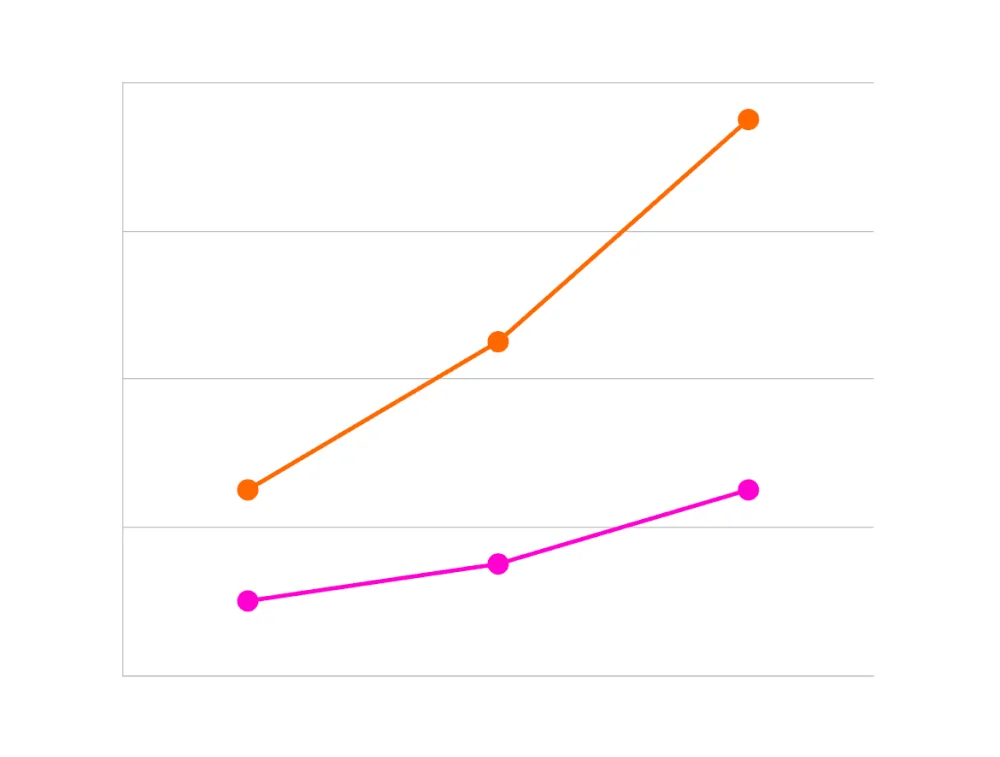
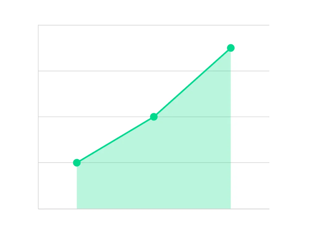
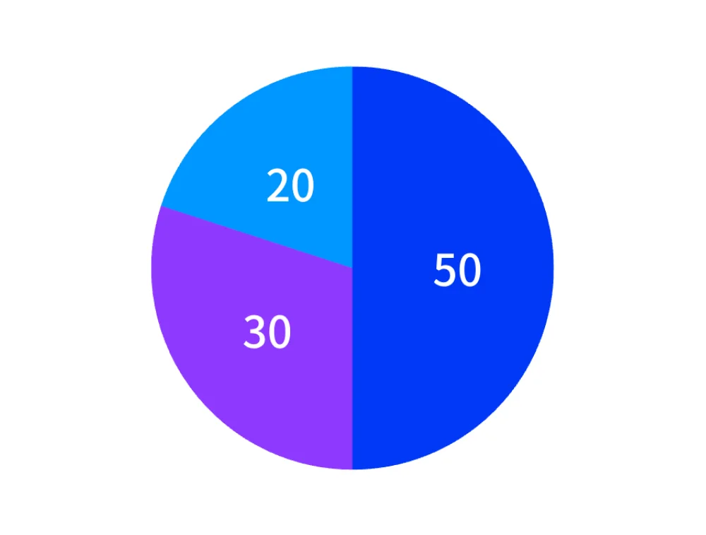
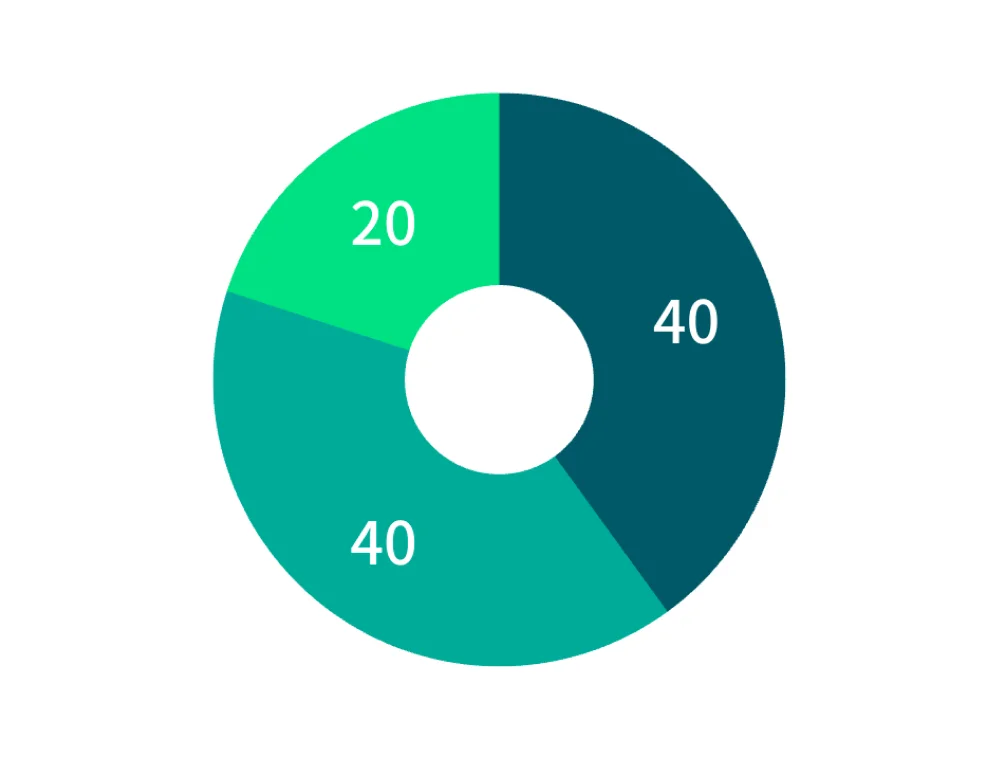
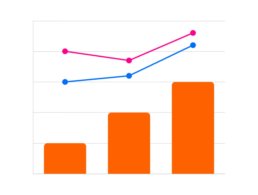
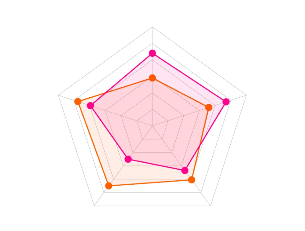
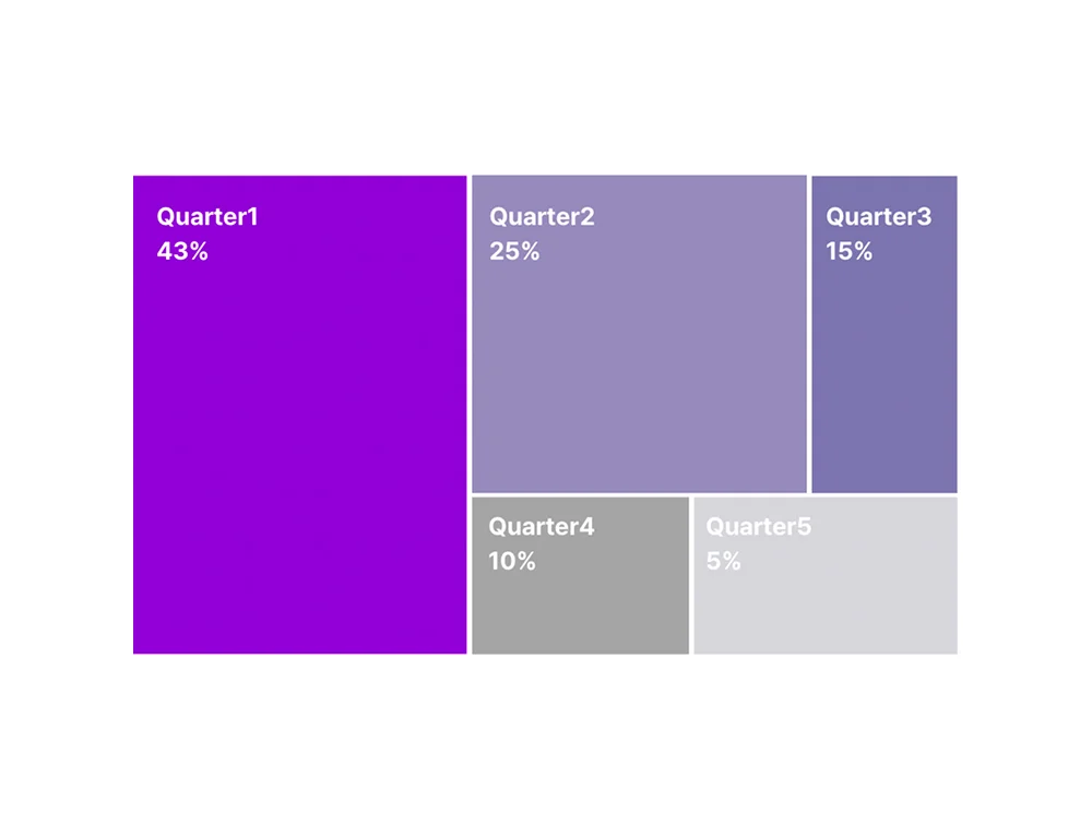


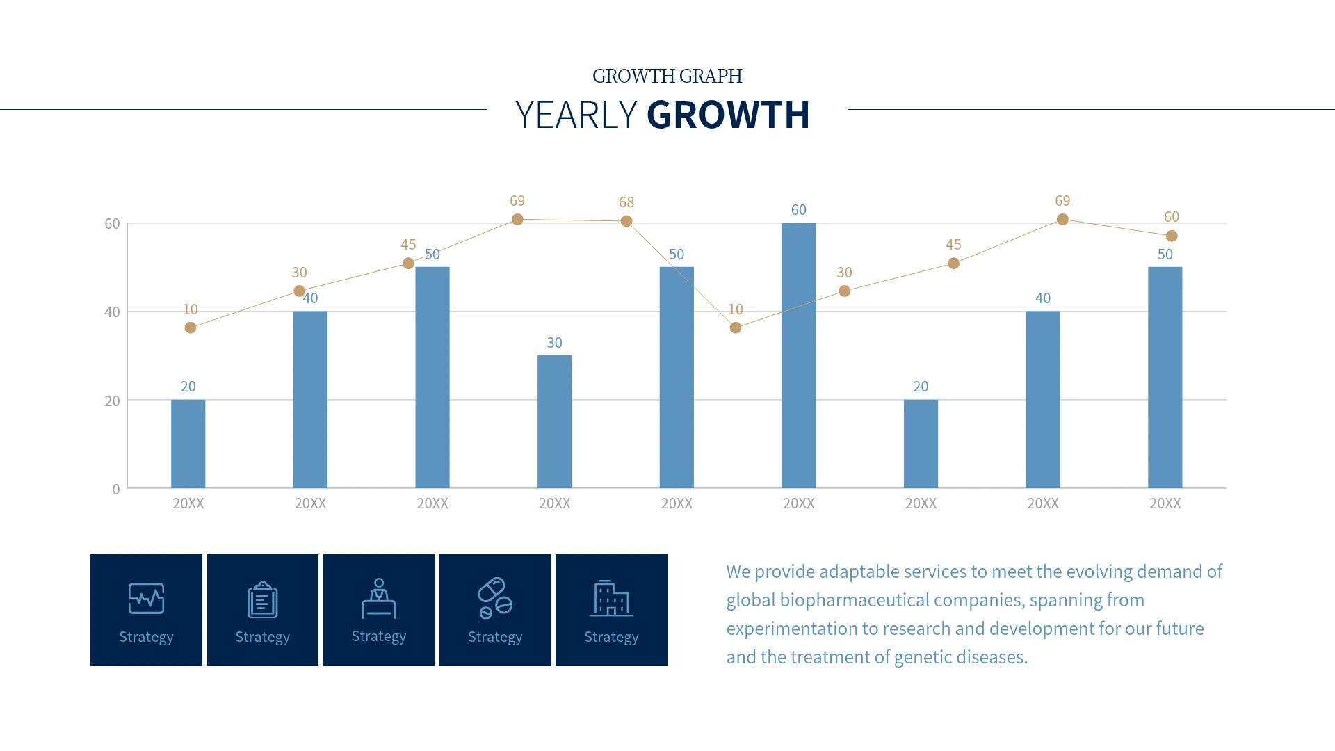
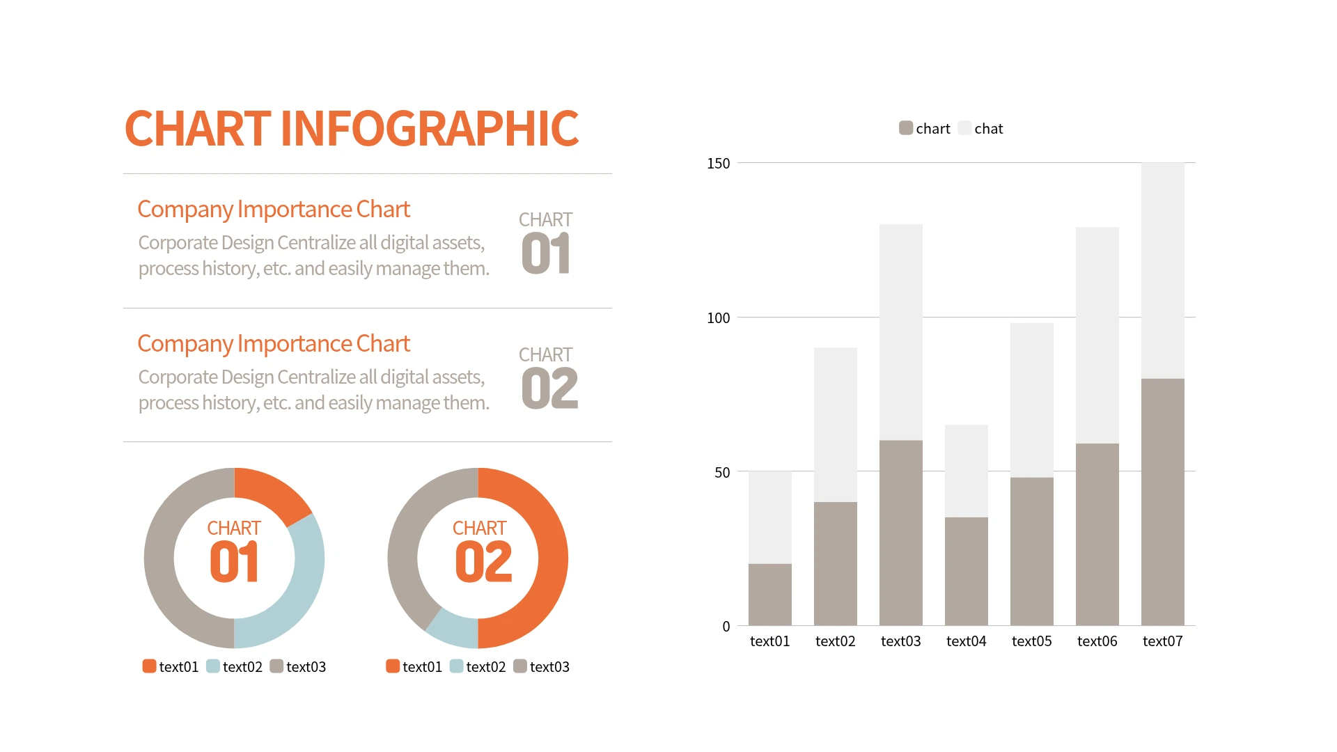
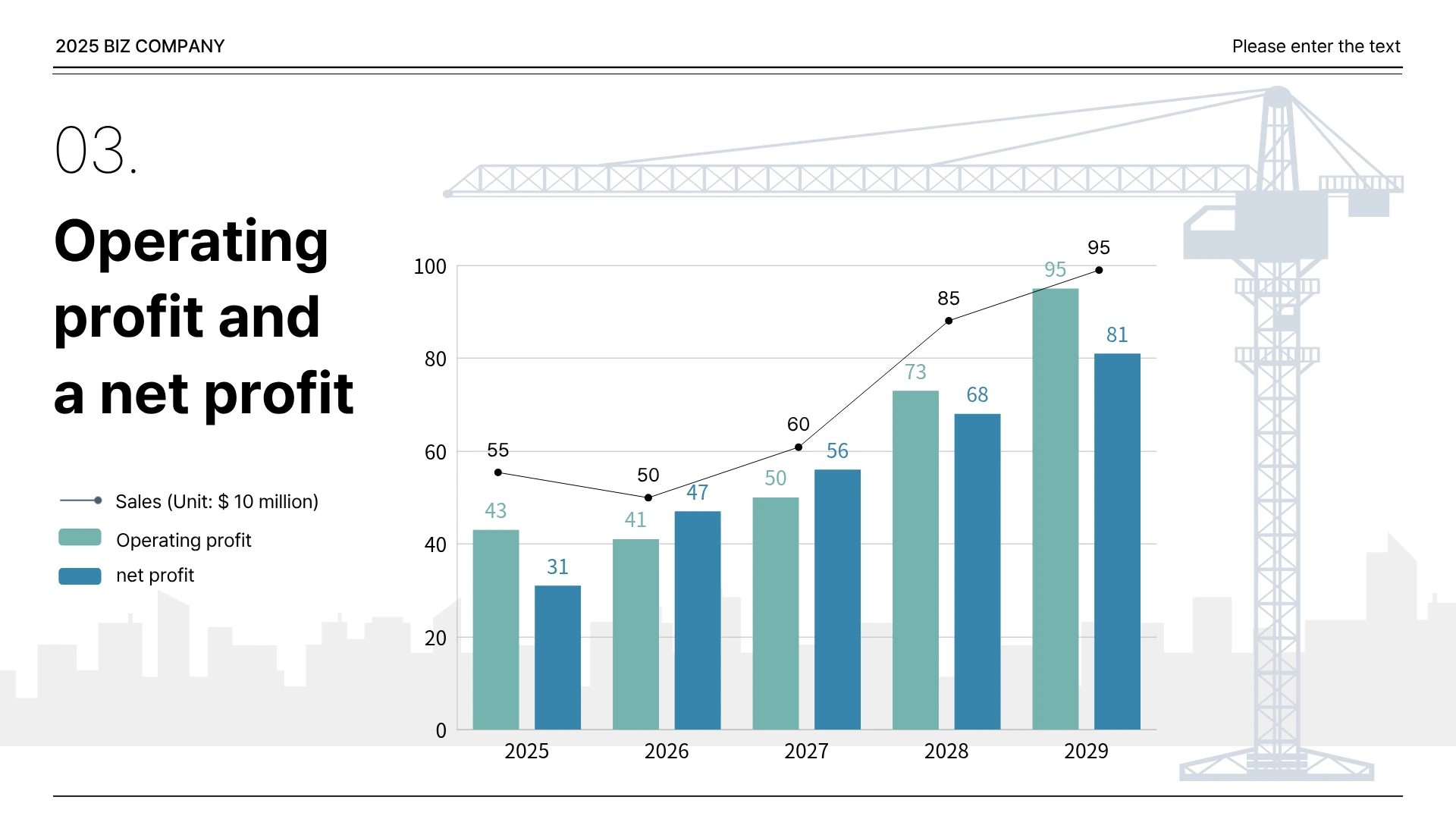
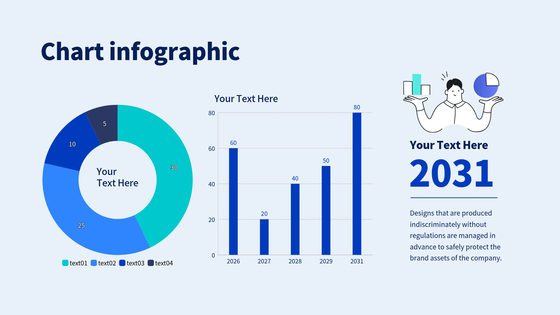
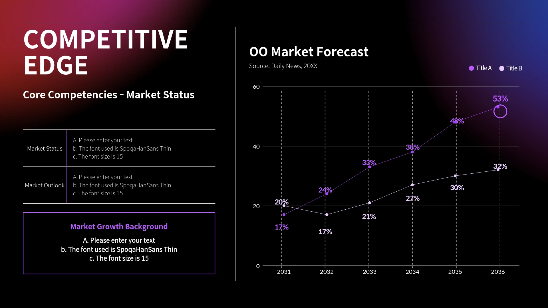
From the [Chart] menu on the left, select a chart type that suits your purpose, such as bar, column, line, pie, or donut, and add it to the canvas.

With Miricanvas's graph and chart creation tool, you can transform vast amounts of data into compelling visual materials. Instantly create them using graph design elements and templates tailored to your purpose, such as statistics or sales. No prior learning is required; anyone can use it with ease.
Graphs and charts generated by simply inputting data
Quickly visualize with professional, ready-made templates
Easy drag-and-drop editing
Freely customize colors and fonts
Go beyond simple number lists and visualize your data with the most suitable chart type. Just input your data, and the results are generated, without worrying about complex calculations or design. You can also switch to different chart types or modify details for each item.

Intuitively compare the size or performance of different items side-by-side.

Understand continuous trends of how data rises and falls over time.

Emphasize changes over time and overall volume by coloring the area below the line.

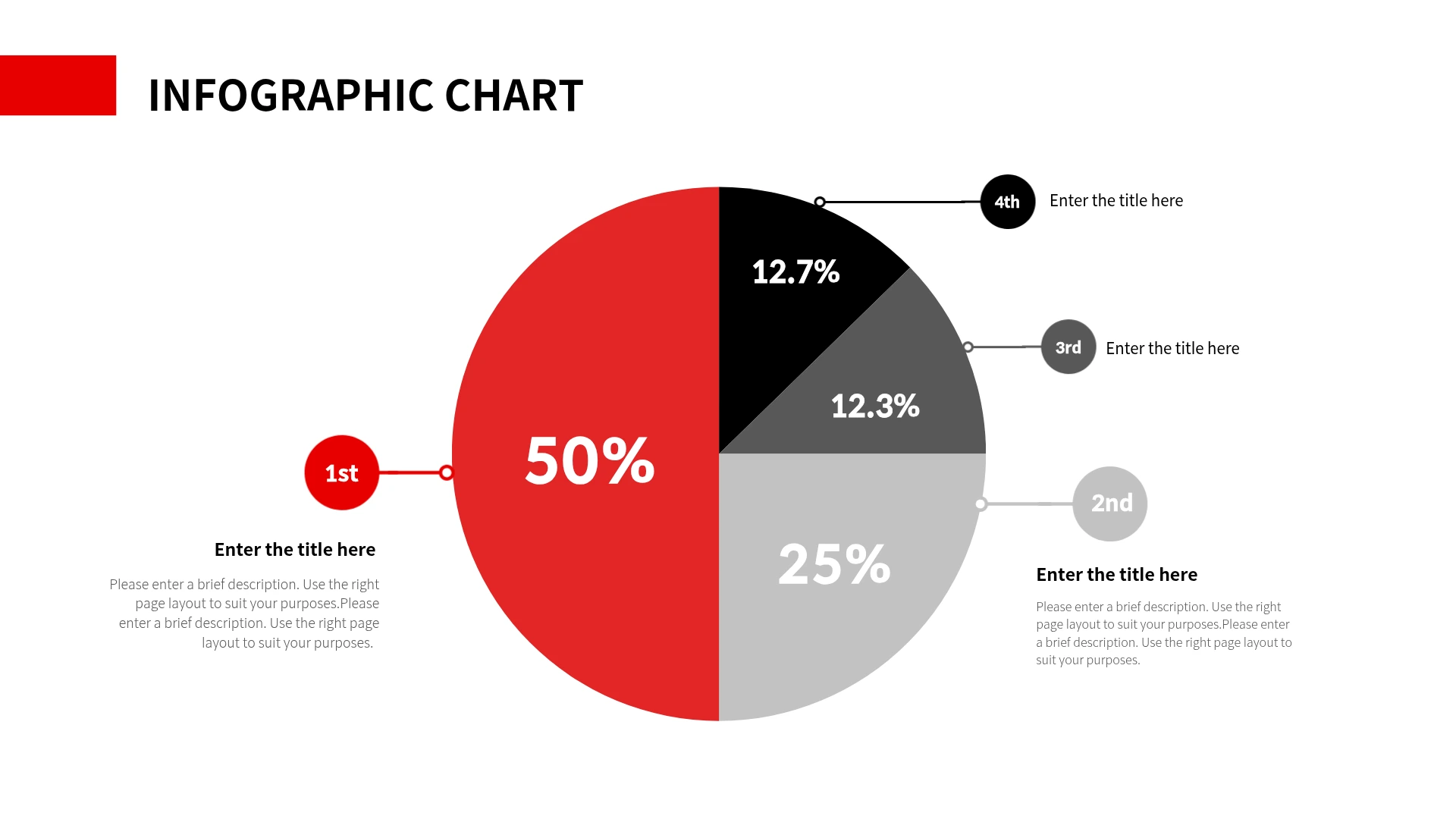
See the proportion each item takes out of the total 100%.

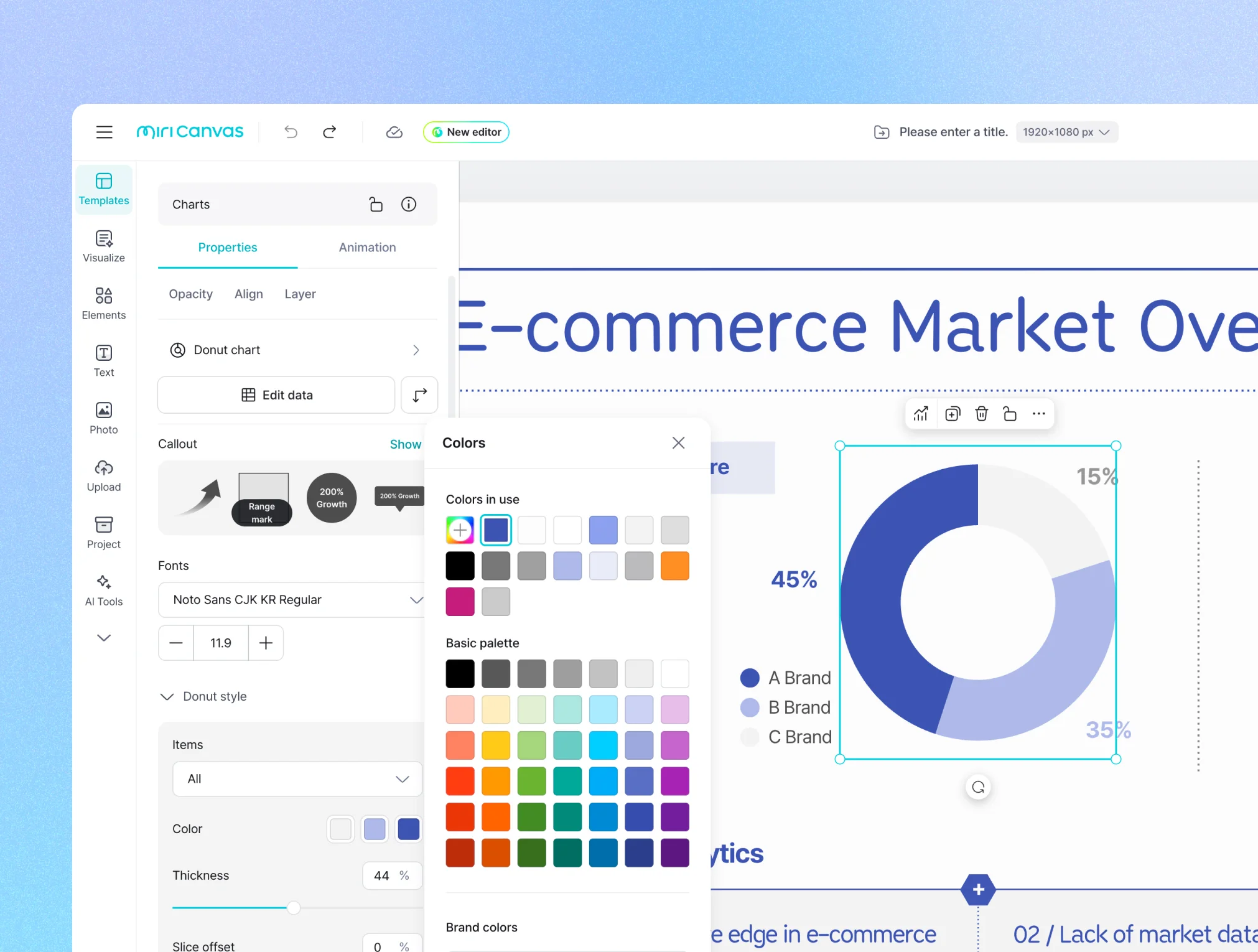
Show proportions like a pie chart, but highlight a key metric in the central space.

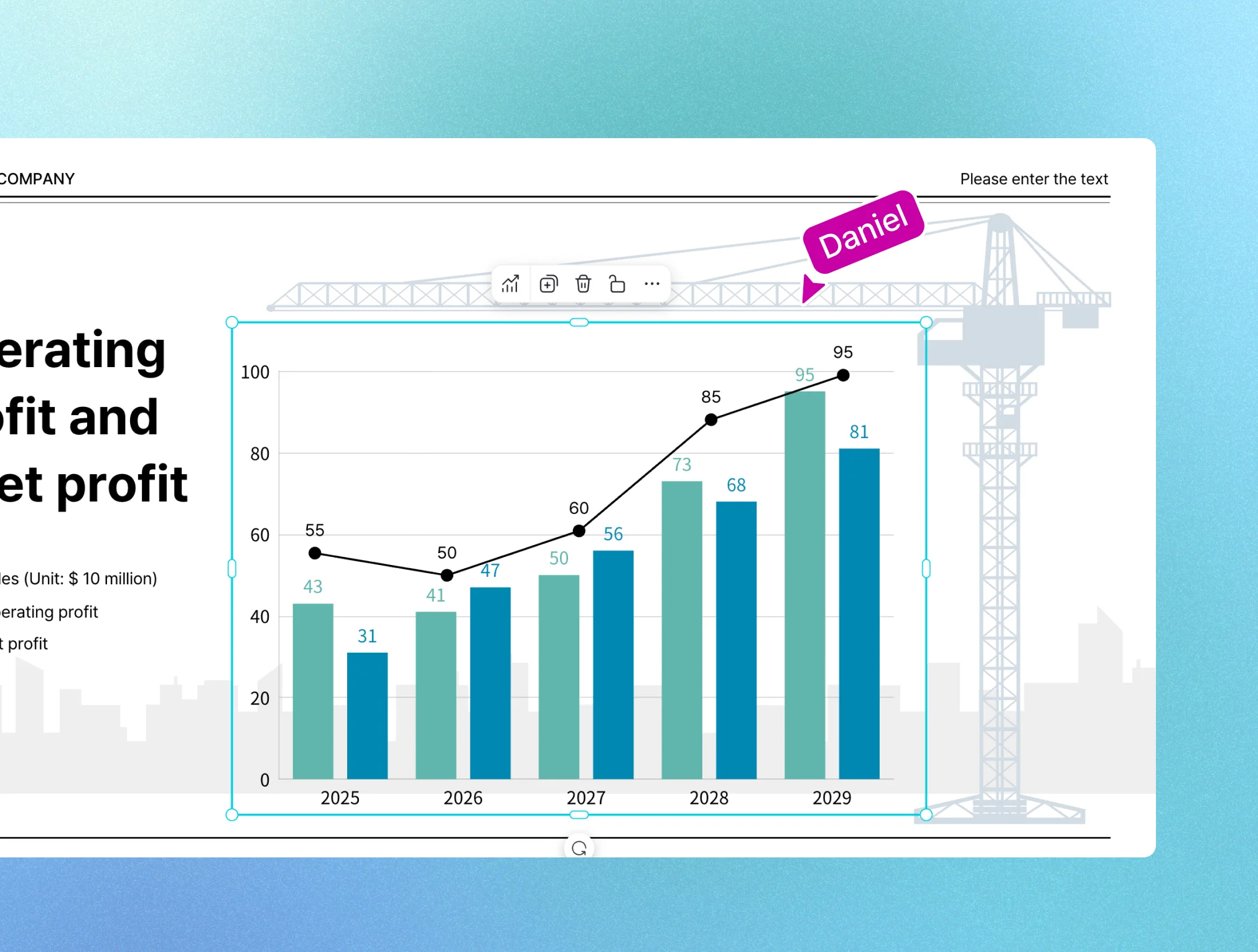
A mixed chart that combines bars and lines to compare different values, such as scale (size) and proportion, at once.

A radial chart that evaluates various abilities or characteristics of a subject from multiple angles.

Compare the proportion each item occupies within the whole by the size of rectangular areas.

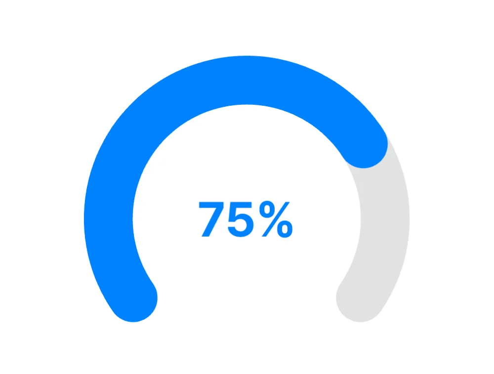
A chart that visualizes and helps understand goal achievement rates or progress.

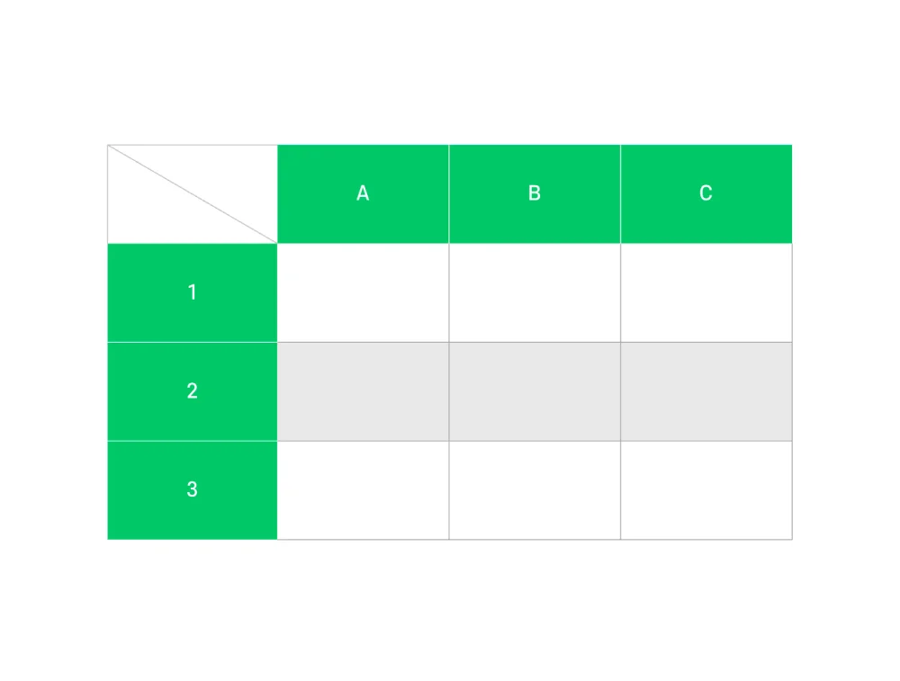
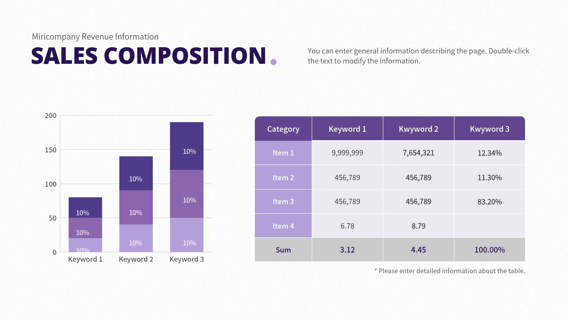
Arrange precise numerical or text data side-by-side in rows and columns for comparison.

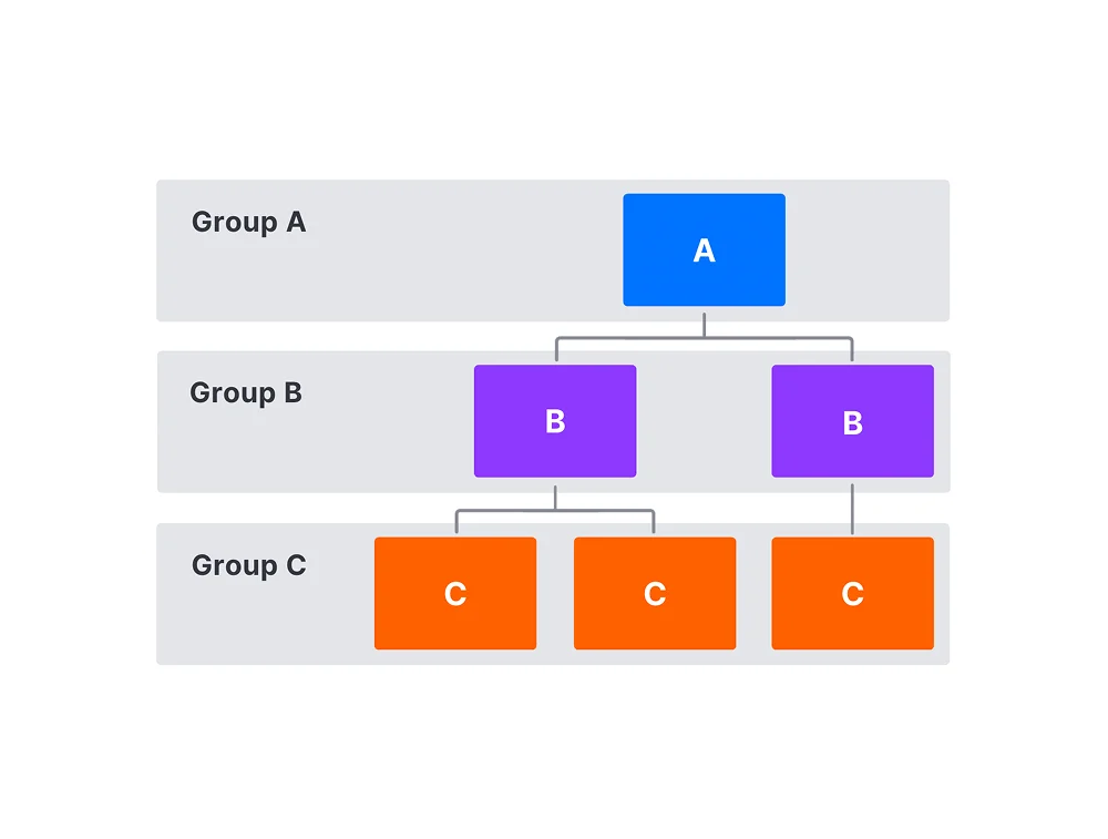
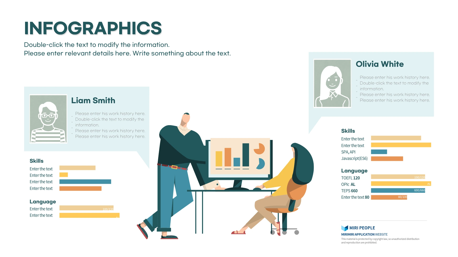
Diagramming the command and reporting structure between departments and members within a company or organization.

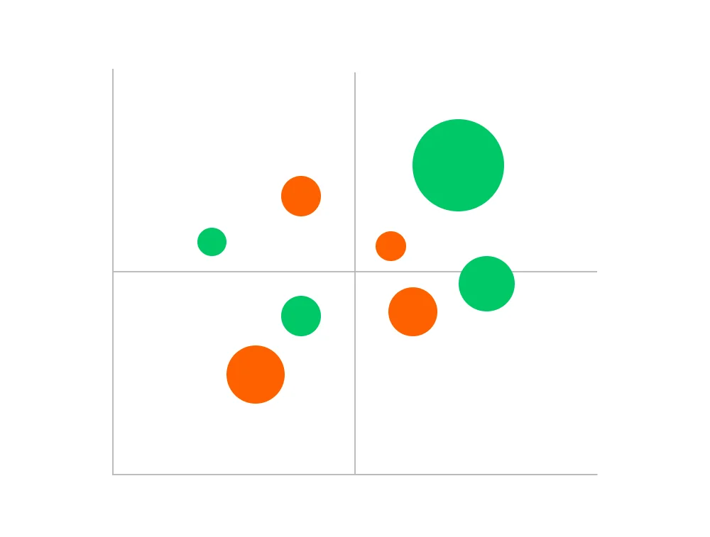
Plot numerous data points to discover correlations or patterns between two variables.

Visualize the relationships and flow of information, such as ideas, structures, and business processes.

Visualize commonalities (intersections) and differences between multiple groups.

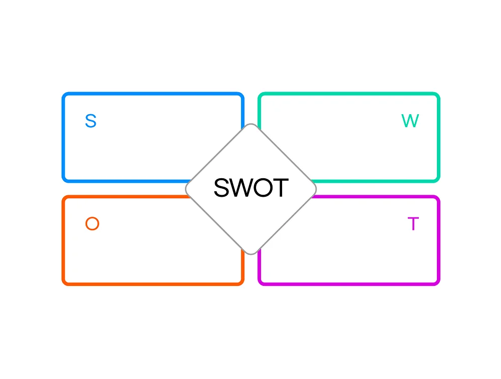
Analyze the strengths, weaknesses, opportunities, and threats of a business or project from four perspectives.
Draw inspiration from a rich library of design elements and templates to quickly produce your desired output. Anyone can create professional-grade visualizations without the pressure of starting from scratch.
Charts and graphs make complex information easy to understand. They are particularly useful for visualizing the hierarchy of ideas, relationships between team members at a glance, and for project management.


Break free from generic, uninspired chart and graph designs. Choose your desired style from templates pre-designed by professional designers, then apply your company's brand colors and fonts. Detailed customization is also available for elements like axes, gridlines, and individual component colors.
You don't need to capture and paste graphs as images. Download your completed graphs and easily insert them into the presentations and reports you're creating. You can also freely add various high-resolution icons and illustration elements to maximize the quality of your reports.


Streamline the often overwhelming process of data visualization and complex editing. By following these 5 simple steps, you can easily create stunning charts.
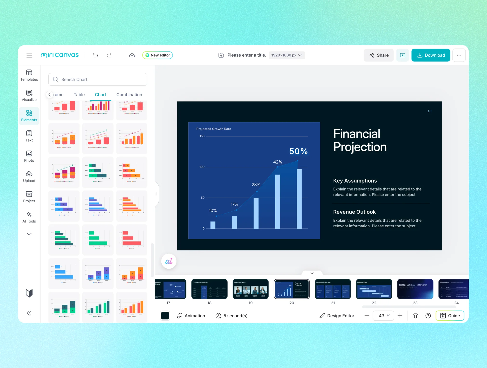
From the [Chart] menu on the left, select a chart type that suits your purpose, such as bar, column, line, pie, or donut, and add it to the canvas.
Double-click the added chart to immediately open the data entry window. Enter your desired values, and the chart (graph) will update in real-time. (Available for bar, line, area, combo, pie, and donut charts.)
In the settings window, individually adjust axes, gridlines, and colors for each data item. You can also fine-tune font type and size, and legend position.
From 'Emphasis Elements' in the settings window or the [Elements] menu on the left, you can add arrows, range markers, illustrations, etc., to visually emphasize the points you want to convey.
The completed graph can be exported in your desired format, such as PNG, JPG, PDF, or PPTX. You can also insert it directly into a PPT or share it via a link.
