
Tools

AI資料作成
AIプレゼンテーション
BEST
AI文章作成·作文
AI ポスター
AIかんたん作成
AI画像生成
AI動画生成
HOT
AI キャラメーカー
AI アイコン作成ツール
AI アイコンメーカー
AIイラスト生成
AI ロゴメーカー
AI フリー背景素材
AIクイック編集
AI画像編集
背景除去
高画質化
写真イラスト化
HOT
New!

イラスト一覧を見る
幅広いシーンで使える高品質イラストをご用意しています。
Plans


Make a pie chart with MiriCanvas's chart feature. Enter your data and you'll have a chart that's ready to drop into a report or presentation. Pick a template you like to get started fast, and edit the colors, fonts, and layout freely with just a few clicks.
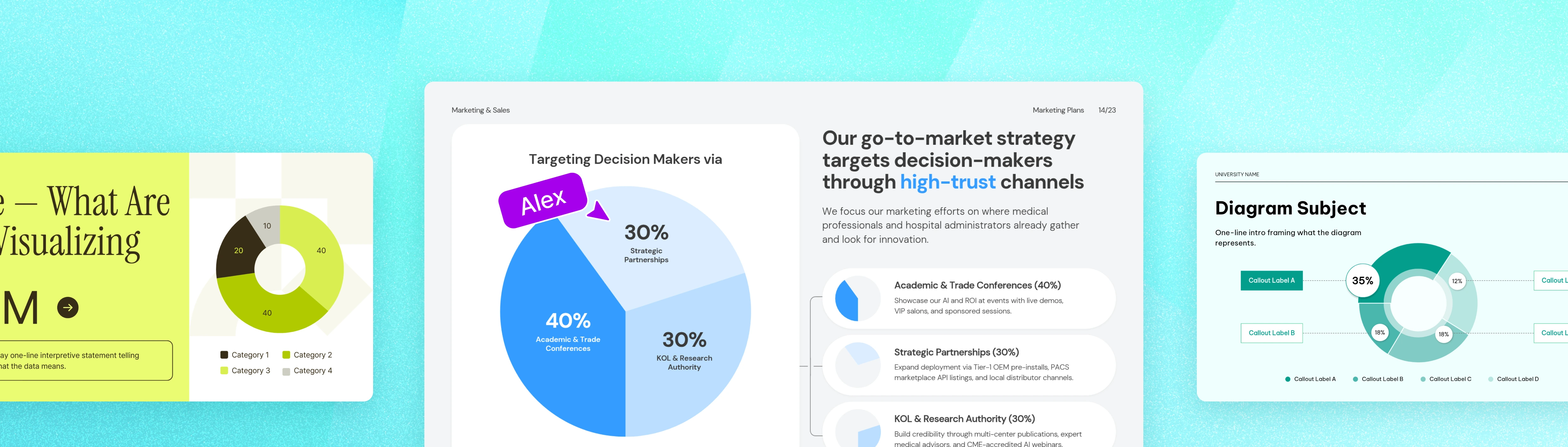
There's no complicated workflow to learn. From entering your data to editing the design, make your own pie chart from start to finish in MiriCanvas.




Start from a template : Open the [Templates] menu on the MiriCanvas site, or click [Create a design] and search "pie chart" in the [Templates] menu on the left of the editor.
Start from a chart: Select the pie chart style you want (pie or donut chart) from the [Chart] menu on the left and add it straight in.
If you started from [Templates], pick a design that fits your purpose, such as a report or presentation. Narrowing by "Presentation" or "Vertical Document" helps you find the right template faster. If you started from [Chart], you can skip this step.
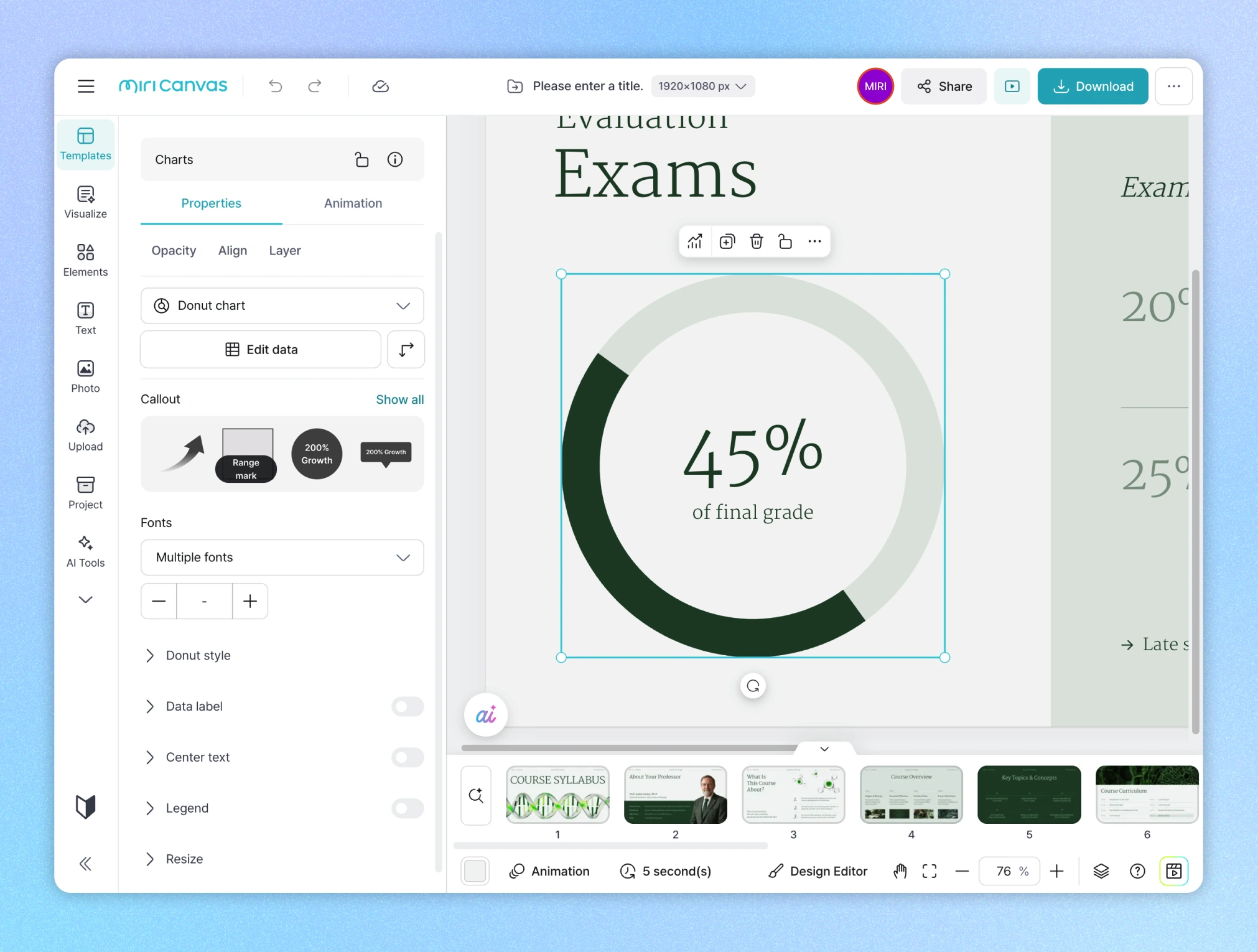
A pie chart takes your whole dataset as 100% and shows the share of each item as a slice of the circle.
The size of each slice is exactly proportional to that item's share. So without doing any math, you can tell at a glance how much of the whole each item takes up, just from the size of its slice. It's one of the most intuitive chart types for showing proportion and composition.
Proportion and composition are hard to convey with numbers alone. The more items you add, the harder a table is to read, and people have to do the math themselves. A pie chart shows the relationship between the whole and its parts at a glance, so the message in your data comes across faster and more clearly.
Add design on top, and that persuasive power grows. A chart unified in your brand colors, with a layout that visually emphasizes the key item, earns trust from your audience and makes your insight stand out.
Make your pie chart and customize the design all in one place with MiriCanvas.
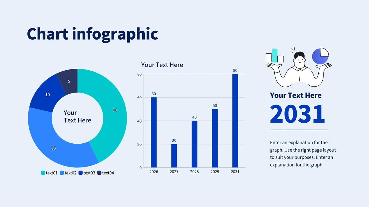
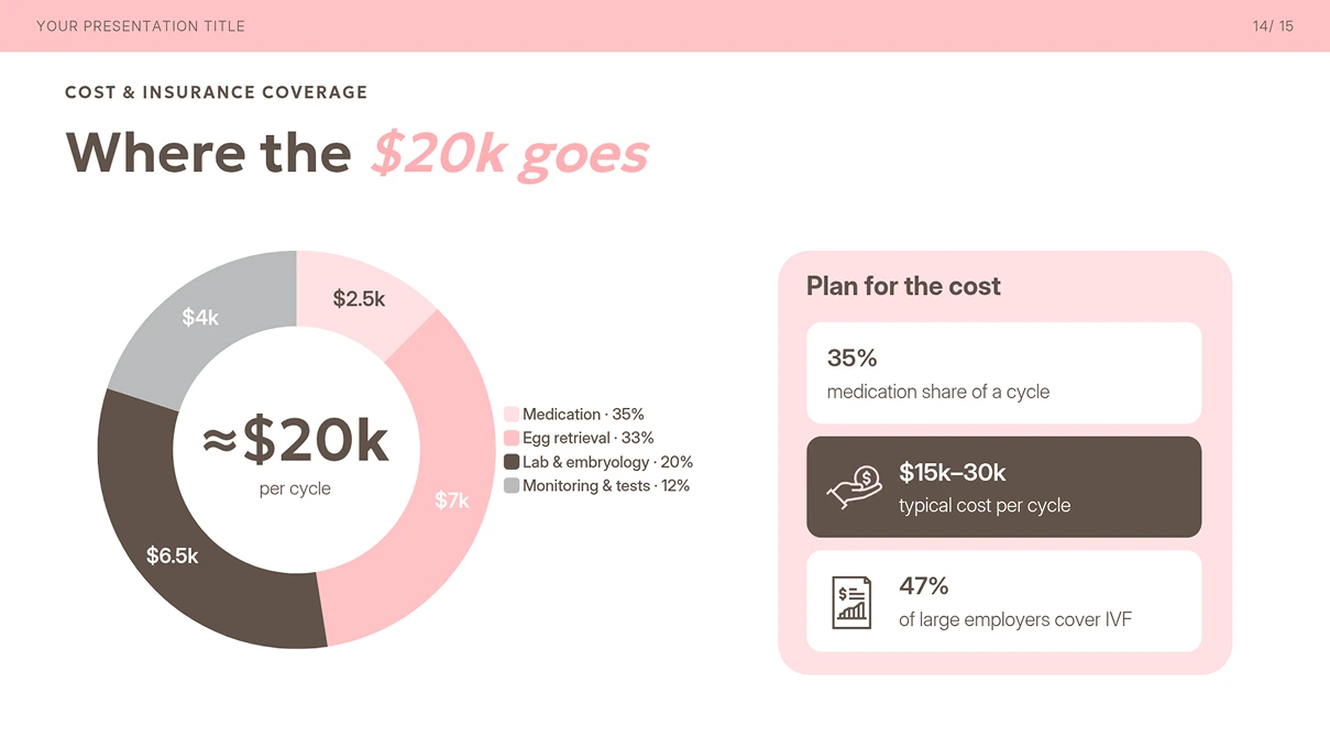
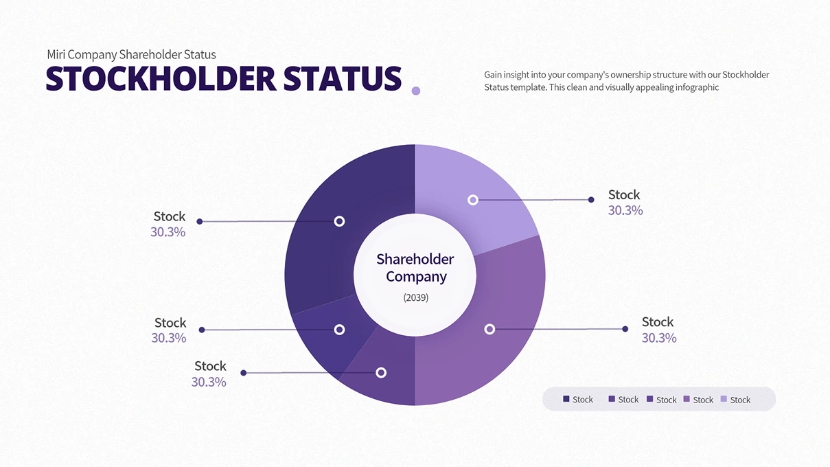
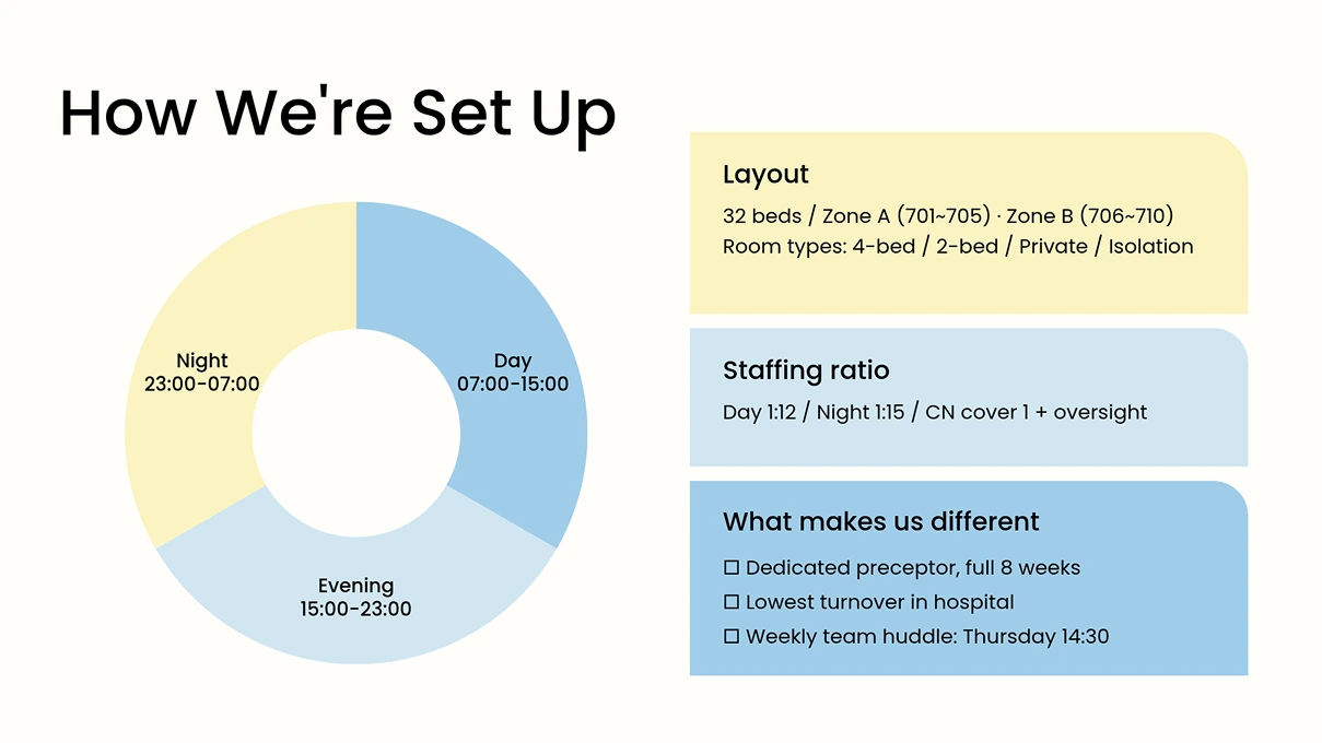
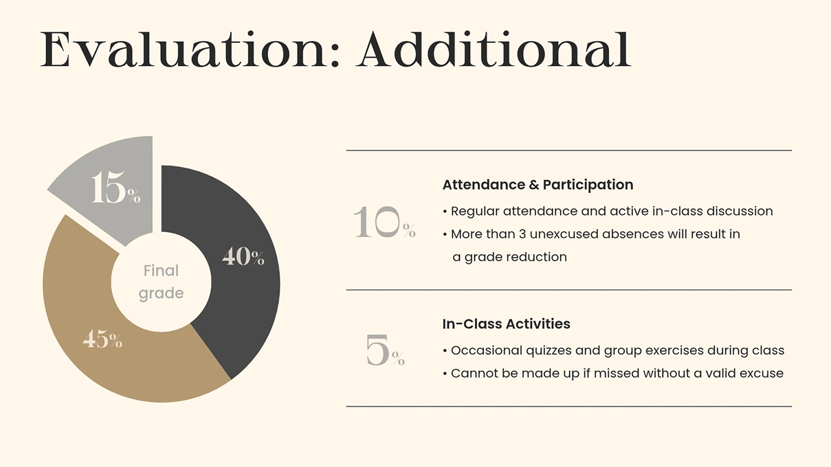
Enter your values and the pie chart comes together right away. Copy data from Excel or Google Sheets and paste it in to skip retyping from scratch. Beyond a standard pie chart, you can switch to types like a donut chart with an open center anytime. Pick the chart that fits your data best.

You don't have to build from scratch. Pick a pie chart template that fits your purpose and just add your data to put a polished design to work right away. Browse templates for reports, presentations, infographics, and more. Want to emphasize a particular item? Add a highlight element. Layer arrows, callouts, or illustrations over your chart to point straight to what you want people to notice.
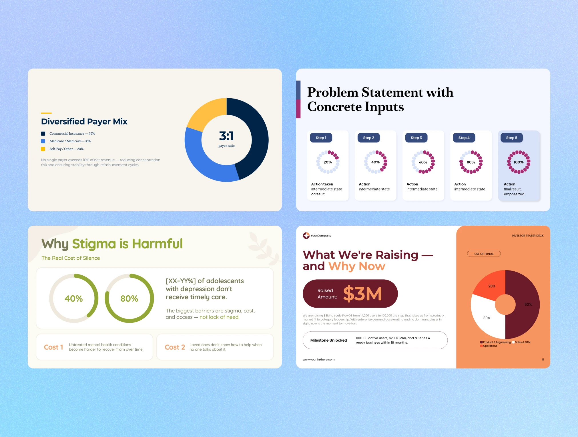
You don't have to use a template as-is. Adjust the color of each item, label placement, legend style, and font style and size, all item by item. Recoloring a single slice to highlight it, or switching the value display to percentages, takes just a few clicks. There's nothing extra to learn, just select what you want in the settings panel.

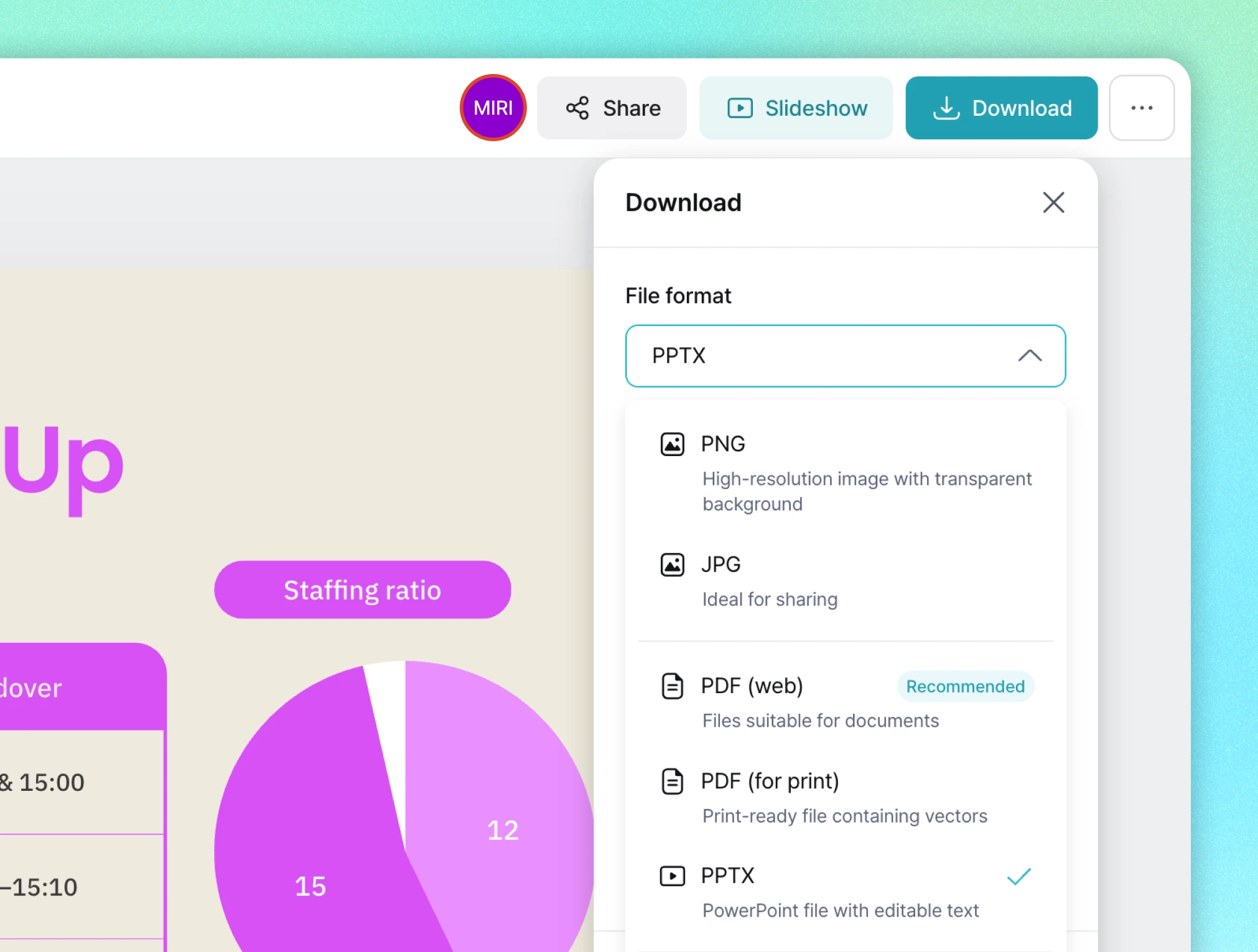
Export your finished chart as PNG, JPG, PDF, PPTX, and more, right away. Insert it into a presentation slide, paste it into a report, or share it with a link, all with no conversion step. From creating it to putting it to use, you can finish in one place.
Pick a pie chart design for your purpose and start right away. Every template stays fully editable after you bring it in.
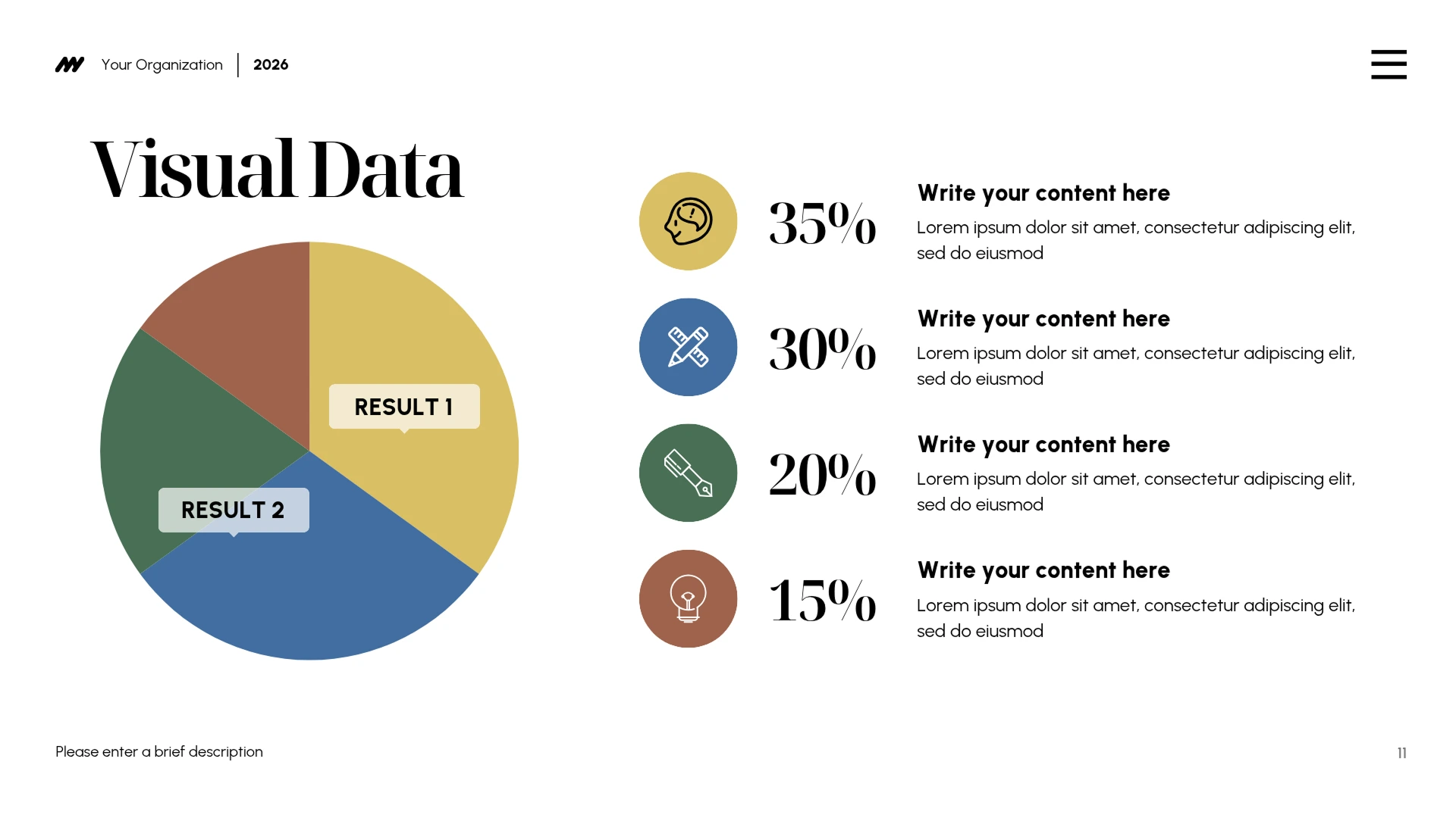
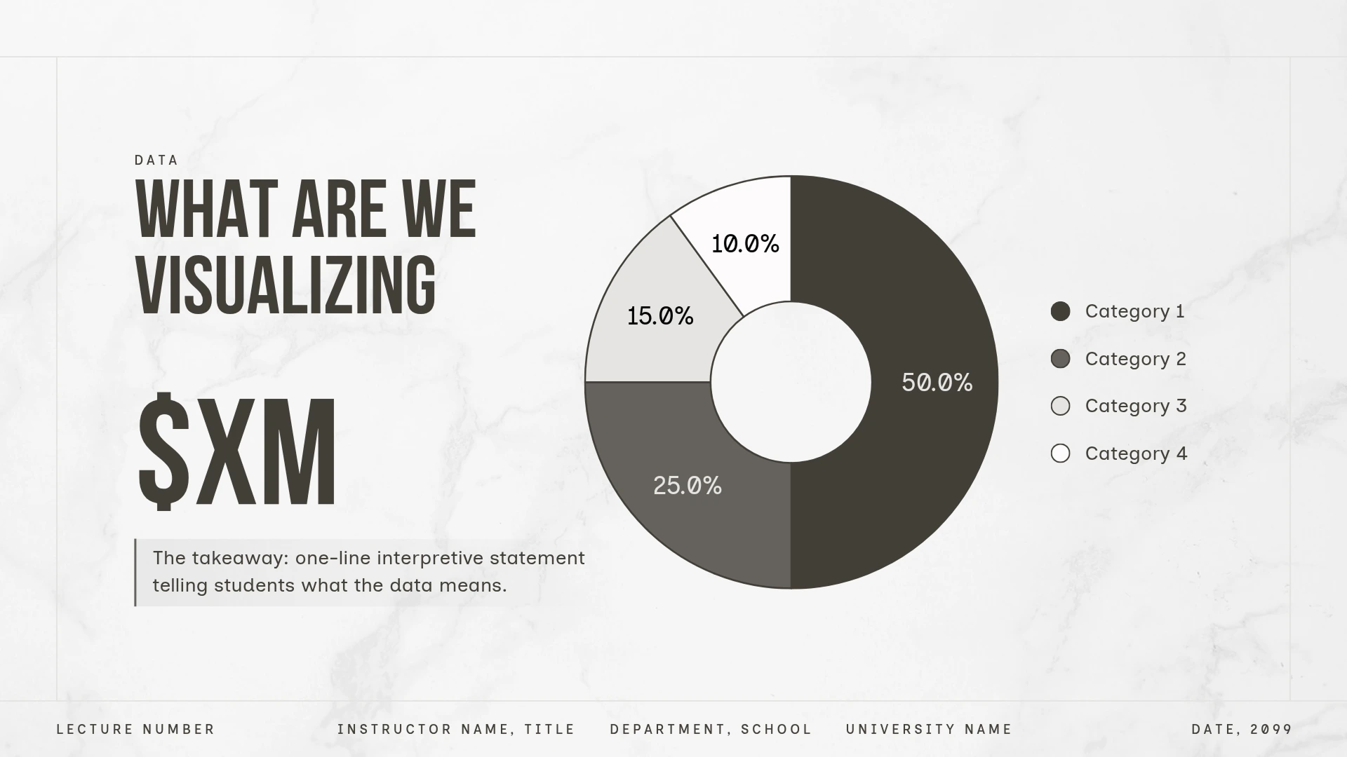
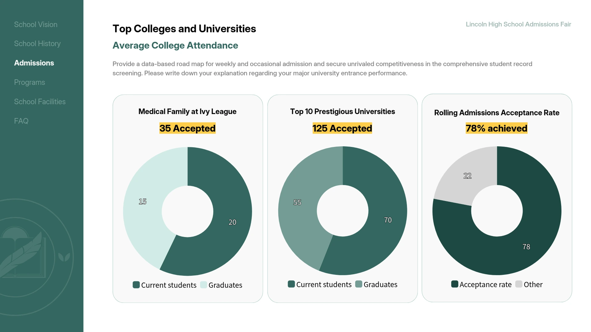
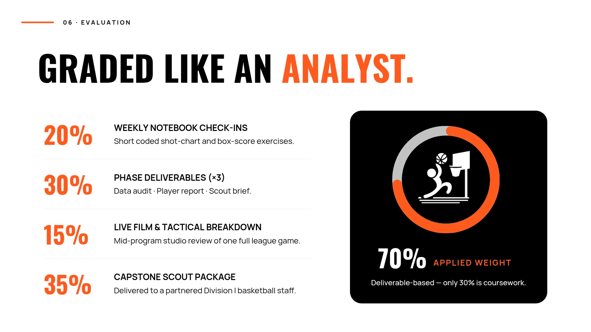
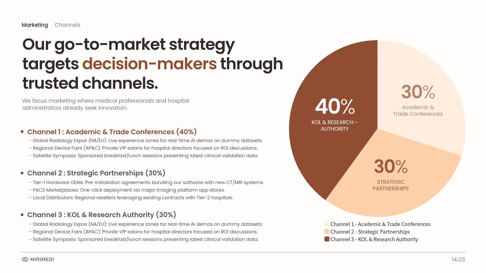
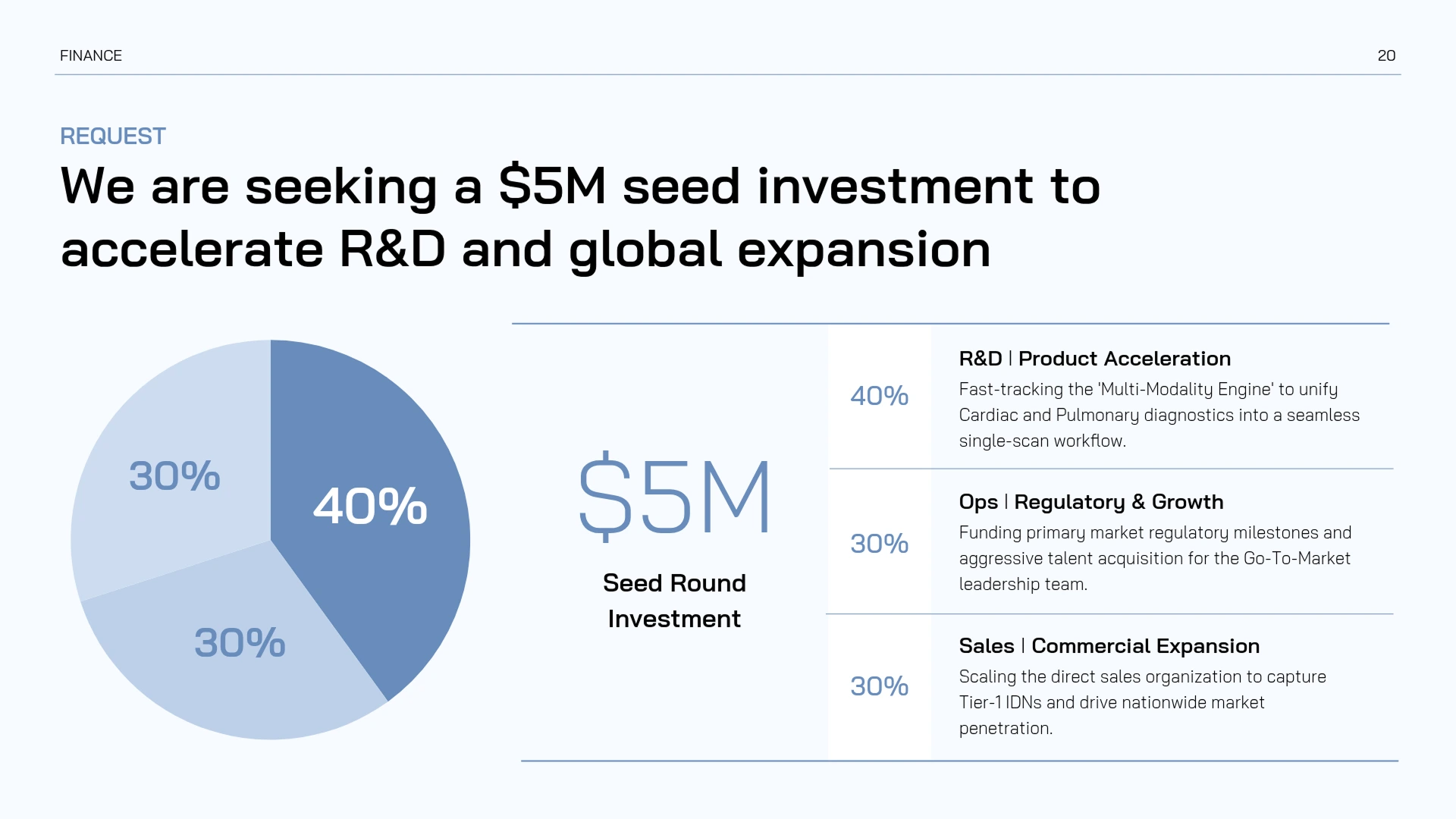
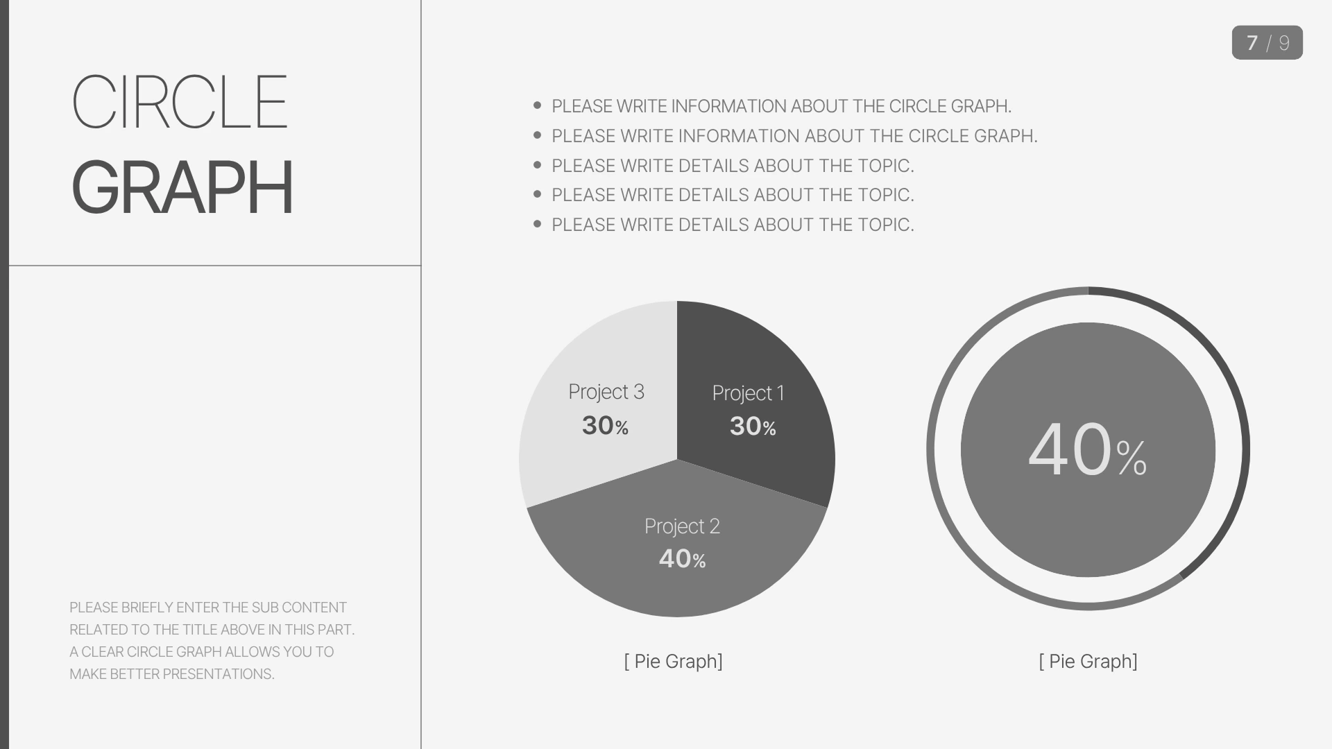
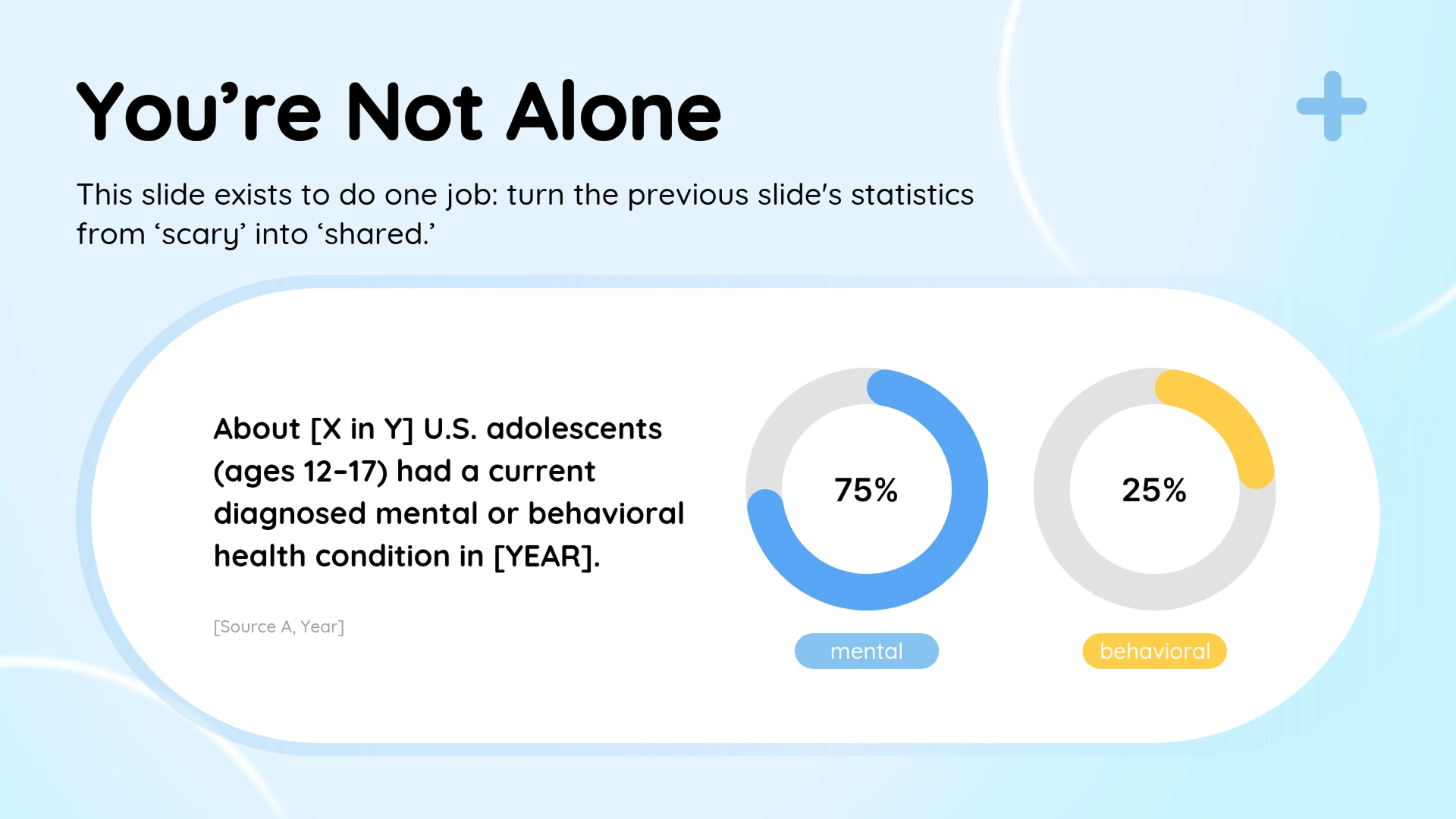

A pie chart fits best when you want to show, at a glance, how much of the whole each item takes up. Use a pie chart in situations like these:
- Visualizing survey response shares, such as the split between yes and no answers.
- Breaking down budgets or revenue by category, such as budget allocation by department or revenue share by sales channel.
- Comparing shares across companies or brands, such as market share.
- Showing population composition, such as the distribution by age group or gender.
Yes. A pie chart is built for showing proportion, so it doesn't fit every dataset.Consider a different chart in these cases:
- When you have more than 6 or 7 items: The slices get too thin to tell the differences apart. With many items, a bar chart works better.
- When the shares are close: Similar slice sizes make it hard to see which item is larger.
- When you need to compare absolute values: A pie chart only shows proportion, so a bar graph is more effective for comparing actual quantities or amounts.
- When the data doesn't add up to 100%: A pie chart can only be used for data whose parts sum to the whole.
Both are proportion charts that take the whole as 100% and show each item's share. The difference is in which point in time they handle.
- A pie chart shows the composition at a single point in time. It fits when you want to convey the share right now, like "how this year's budget is split by item."
- A 100% stacked bar chart lines up the proportions from several points in time side by side to compare the change. It fits better for showing change over time, like "how the budget composition shifted across 2022, 2023, and 2024."
For the same proportion data, use a pie chart to show the composition at one moment, and a 100% stacked bar chart to compare change across several moments.
Yes, you can make pie charts on the free plan. You also get free access to over 50,000 templates and over 350,000 photos and graphics. If you want premium templates and AI features too, upgrade to the Pro plan. You can see the details on the Pricing page.
Yes. Once your pie chart is complete, export it as a PPTX file and open it directly in PowerPoint. If you'd prefer to build the entire presentation in MiriCanvas, you can also try the AI Presentation Maker.
Pick a template you like and just enter your data. Colors and layout adjust with a few clicks. Start free in MiriCanvas.



