
Tools

AI資料作成
AIプレゼンテーション
BEST
AI文章作成·作文
AI ポスター
AIかんたん作成
AI画像生成
AI動画生成
HOT
AI キャラメーカー
AI アイコン作成ツール
AI アイコンメーカー
AIイラスト生成
AI ロゴメーカー
AI フリー背景素材
AIクイック編集
AI画像編集
背景除去
高画質化
写真イラスト化
HOT
New!

イラスト一覧を見る
幅広いシーンで使える高品質イラストをご用意しています。
Plans


Make a Halloween poster that gets noticed. Follow five simple steps to choose a template, style your design, and get it ready to print or share.
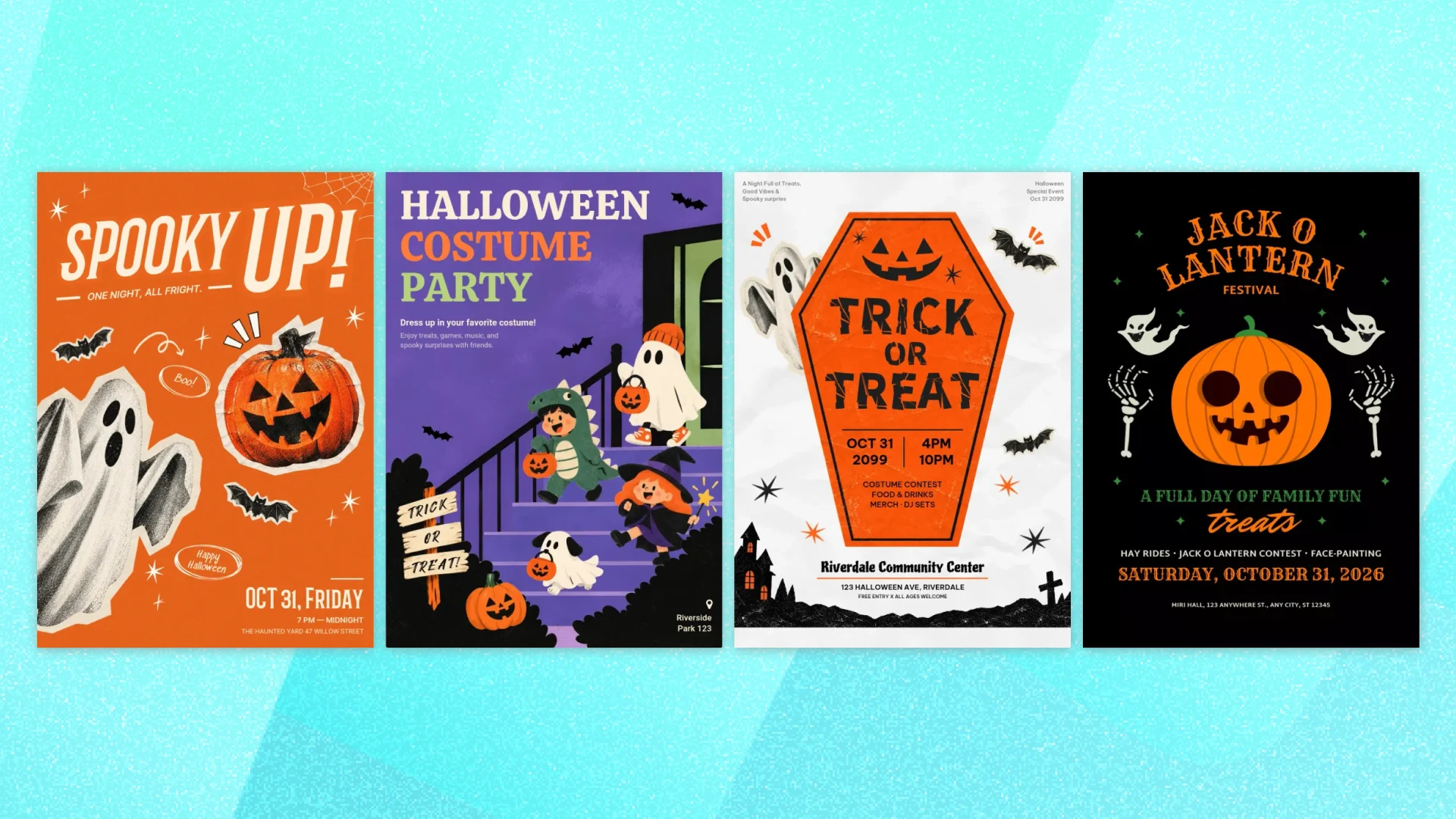
A ghost catches your eye. The headline makes the party sound fun. The date is easy to find. That’s a Halloween poster doing its job.
You don’t need to build the design from scratch to get there. Start with a template, add your event details, and make a few thoughtful choices about color, fonts, and illustrations.
In this guide, we’ll turn a Halloween template into a poster for an elementary school family night. Follow these five steps to make a design that feels festive and gives people everything they need to show up.
Looking for a design direction first? Browse Halloween poster ideas for examples organized by event type.
It’s easier to choose a layout when you know what needs to fit on it. Gather these five things before you begin.
The event name. Keep it short and clear. “Halloween Family Night” tells readers what to expect without taking up too much space.
The date and day of the week. Include both so people can plan at a glance. For an event on Halloween in 2026, that would be Saturday, October 31.
The start and end time. This helps families plan around dinner, bedtime, and other Halloween activities.
The location. Include the venue and street address. If the event takes place in a specific part of a school, name that too.
The main instruction. Let people know what to do next, whether that’s wearing a costume, bringing a treat bag, or registering in advance. Keep any other necessary instructions brief.
For this walkthrough, we’ll use these sample details:
Open MiriCanvas in your browser and decide where your poster will appear.
For a school bulletin board or a take-home flyer, a portrait layout is a practical starting point. If you’re printing on standard US office paper, choose a letter-size design at 8.5 × 11 inches. For a larger poster, check the required dimensions with your print shop before you begin.
If you also plan to share the design online, check how it fits the intended post or screen. You can reuse the same design, but you may need to adjust the layout for a different shape.
The templates linked below use a portrait web-poster format. If you’re using one for print, check its dimensions and how the artwork fits your chosen paper size.
For this walkthrough, keep your working canvas at US Letter size and check the layout after applying the template.
Browse the Halloween poster templates and look for a layout that can hold your event details comfortably.
A large illustration might be the first thing you notice, but check the text areas too. Is there room for the full event name? Can you add a street address without making it tiny? Is the date easy to spot?
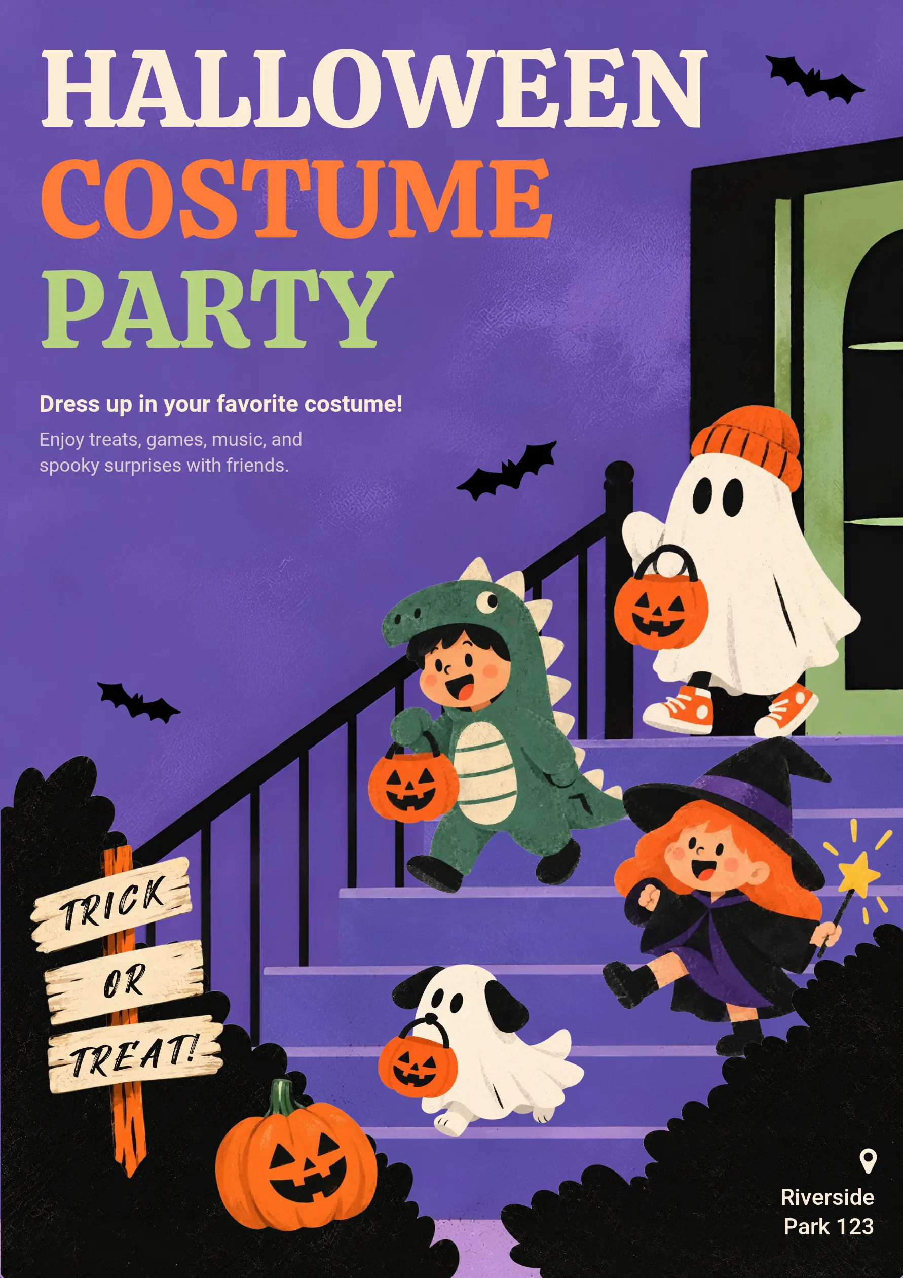
For our school family night, we’ll use this purple Halloween costume party template. It features children in costumes and friendly ghost characters on a staircase, making it a good starting point for a family event.
The title and short description sit toward the upper left, while the location appears at the bottom right. We’ll update those text areas and keep the illustrated scene.
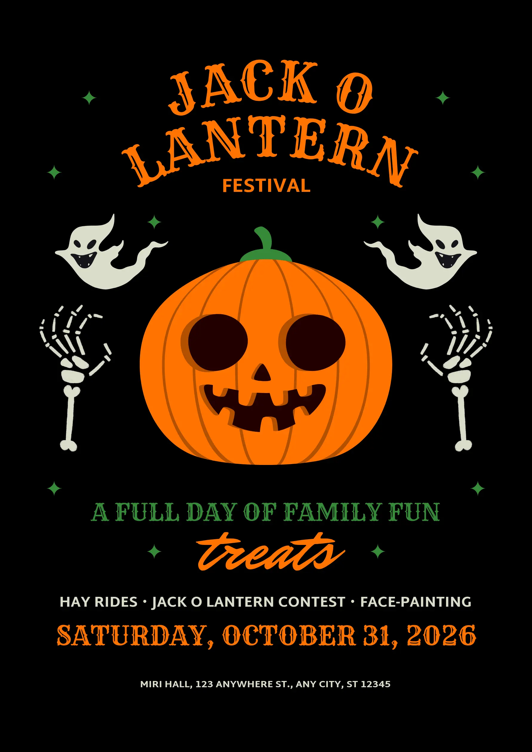
For a festival with several activities, a layout like the one below may work better. It has space to list attractions such as hayrides, a pumpkin contest, and face painting.
Replace the sample text with your event name, date, time, location, and main instruction.
Start with the headline, then work through the details. Keep the headline short enough to fit comfortably, but don’t worry about matching the original word count. Adjust the line breaks or text size if needed, and avoid shrinking the title until it becomes hard to read.
For our example, change “HALLOWEEN / COSTUME / PARTY” to “HALLOWEEN / FAMILY / NIGHT.”
Use the description area below the headline for Saturday, October 31, 2026, the 6–8 p.m. time, and “Come in costume!” Give the date and time their own lines so they’re easy to find.
Replace “Riverside Park 123” at the bottom right with your school’s name, gym location, and street address. If the address needs more space, widen or reposition the text box instead of making the text too small.
Delete any sample wording you don’t need, and check that every detail matches your event.
Once your wording is in place, you can see whether the design still feels balanced. Focus on a few changes that make it suit your event and easier to read.
Choose a small color palette.
The purple background already works with the cream, orange, and green lettering. Keep those colors as your starting point instead of adding several new ones.
Try cream lettering for the date, time, and costume instruction against the purple background. Keep the school address light against the dark area at the bottom, and check that every detail remains readable when the poster is viewed at a smaller size.
Give the headline personality and keep the details simple.
A bold, playful font suits a school Halloween event. Decorative or spooky lettering can work for the headline, but use a simpler font for the address and time.
You don’t need to change every font in the template. Start by checking that the event name is the first thing you notice and the date is easy to find next.
Keep the illustrated scene.
The children, ghosts, pumpkins, and bats already give this poster its Halloween character. Keep the staircase scene and leave space around your event details.
If a small decoration crowds the updated wording, move or remove it instead of adding more artwork.
Before downloading, read every line once more. Check the date, day of the week, time, address, and any registration details.
Then preview the poster at a smaller size. Can you still read the event name and date? If you’ll share it on social media, look at it on your phone and check for cropped text or details that are too small.
For printing, review the design at the intended output size and print a test copy if possible.
Download a PNG for sharing online. For printing, use an appropriate PDF option and check your printer’s or print shop’s requirements, including the finished size and any bleed or margin specifications.
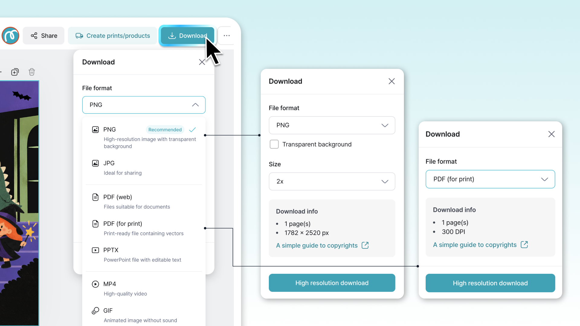
Important details are too small.
A large title can draw attention, but people also need to find the date, time, and location. Give those details enough space instead of squeezing them into the last available corner.
Sample text survives.
Look for the template’s original venue, date, slogans, or placeholder information. Reading the poster aloud can help you catch something you’ve skimmed past.
Decoration crowds the message.
If webs, bats, and pumpkins crowd the wording, remove a few. Keep the main illustration and leave space around the text.
The design isn’t checked in its final format.
A poster that looks clear in the editor may be difficult to read on a phone or when printed. Preview each version before sharing it.
No. MiriCanvas runs in a browser, and the editor is free to use. You can start a poster on one machine and finish it on another.
Yes. You can make a Halloween poster with MiriCanvas’s free plan using free templates and elements. Some templates and design elements require payment, so check what’s included before downloading.
Choose the size based on where you’ll use it. US letter size, 8.5 × 11 inches, works well for school handouts and office printing. For a larger poster, confirm the dimensions with your print shop. If you’re also sharing it online, check that the layout fits the intended post and that the details remain easy to read.
Yes. Ask the shop which file format, finished size, and bleed or margin settings it needs before downloading. If it accepts PDF, choose the appropriate print option and check the exported file before sending it.
Yes, colors and fonts are editable. That is worth doing when your poster will hang somewhere every other notice is already orange and black.
There are eleven of them, grouped by the kind of event, in Halloween poster ideas. That article covers school nights, trunk-or-treat, shop promotions, and grown-up parties.
Pick a free template, edit the text and images, and your poster is ready in minutes.
Browse templates


